Recently added
Vintage shirts
Concept kits
Legends
The MLS kits you need to know
by Phil Delves February 24, 2024 4 min read 914 Comments

The best 2024 MLS football shirts
In a few short hours the 2024 MLS season will kick off. For all the frustrations surrounding the price of MLS kits, not to mention the egregious disparity between replica and player spec shirts, the designs themselves have proven to be a hit amongst collectors in recent years. This season is shaping up to be no different, with a good range of looks and something to suit most tastes.
I've picked out a few personal favourites for your enjoyment.
2024 Minnesota United shirt
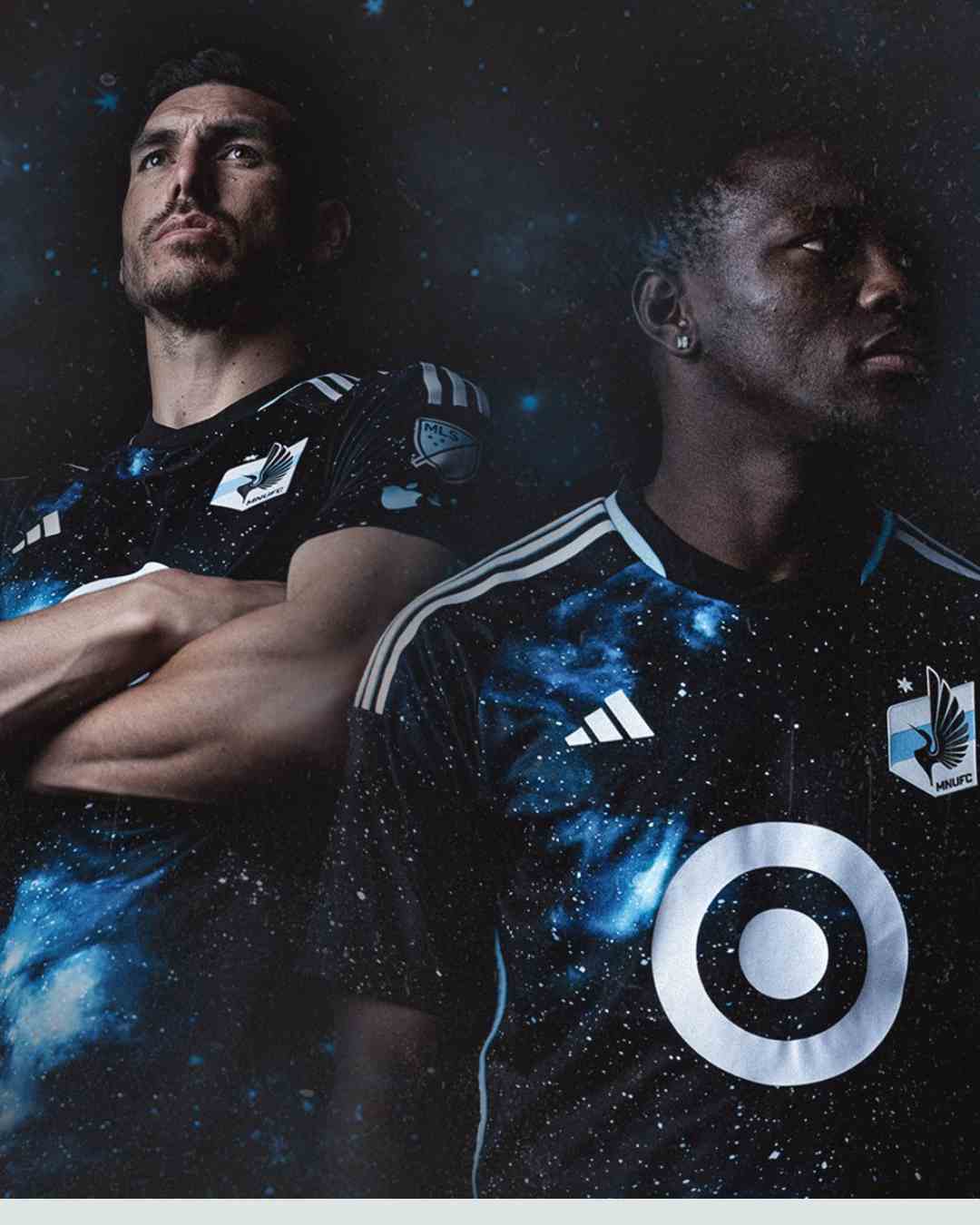
Let's start with perhaps the most dazzling of the class of 2024. Minnesota United have been one of the better teams in MLS when it comes to kit design since their ascension to the league in 2017 (can you even "ascend" in a league structure without promotion/relegation?). Their 2024/25 home carries on that tradition and some with an all-over galaxy pattern on a black base. Helping to cement the look are the colours seen in the galaxy itself, with various blue tones producing a pleasing aesthetic whilst also tying into the club colours.
Though a plain back interrupts the pattern party (this is a league-wide problem, unfortunately) it's good to see the extension of the stars across the sleeves. Embossed details on the hem of the shirt are another nice touch. Other than the plain back, my main disappointment with the shirt is that, at least from the release pictures I've seen, there aren't any tasty details in the form of a jock tag or back neck detail. MLS teams are typically very strong in the area, and a well placed design element could have elevated this one to even greater heights. Regardless it remains a highlight.
2024 San Jose Earthquakes away shirt

Though not nearly as eye-catching, I want to also mention the San Jose Earthquakes away. At first glance this is a plain white shirt with red details; hardly a design worth our time. On closer inspection however there are some really strong touches, and it starts with the embossed details. In the red panels at the side of the shirt are a series of shapes including retro elements from the teams past such as old crests. As I've mentioned many times before in Collectors Club I'm a huge fan of embossed details such as these, as it's the kind of thing which could easily be missed.
The other star of the show is the retro crest. This could easily be marked as "nostalgia bait", a lazy, shameless attempt to cash in on the enduring popularity of the retro aesthetic, but in a world of overly-corporate logos for crests an old-school look such as the one San Jose have resurrected is a breath of fresh air. It's a shame we can't return to the days when crests such as these were splashed across the chest of a shirt in as big a size as possible, but I'll take the small scale look we ended up with.
Here are two more MLS kits for your consideration.
2024 Vancouver Whitecaps football shirt

The first is a gorgeous take on the anniversary theme. Many anniversary kits run down the oft-trodden black and gold road, but Vancouver Whitecaps have taken the daring decision to go navy and gold. I know, it's hardly a big departure, but the simple point of difference is enough to make me take a closer look. And indeed, once you look more closely you'll be able to enjoy the embroidered jock tag detail and the crest which, like the San Jose crest mentioned previously, is a look unearthed from the past. The flashes of white on the neckline and back panels of the kit complete the look (as do the white socks).
2024 Austin FC shirt
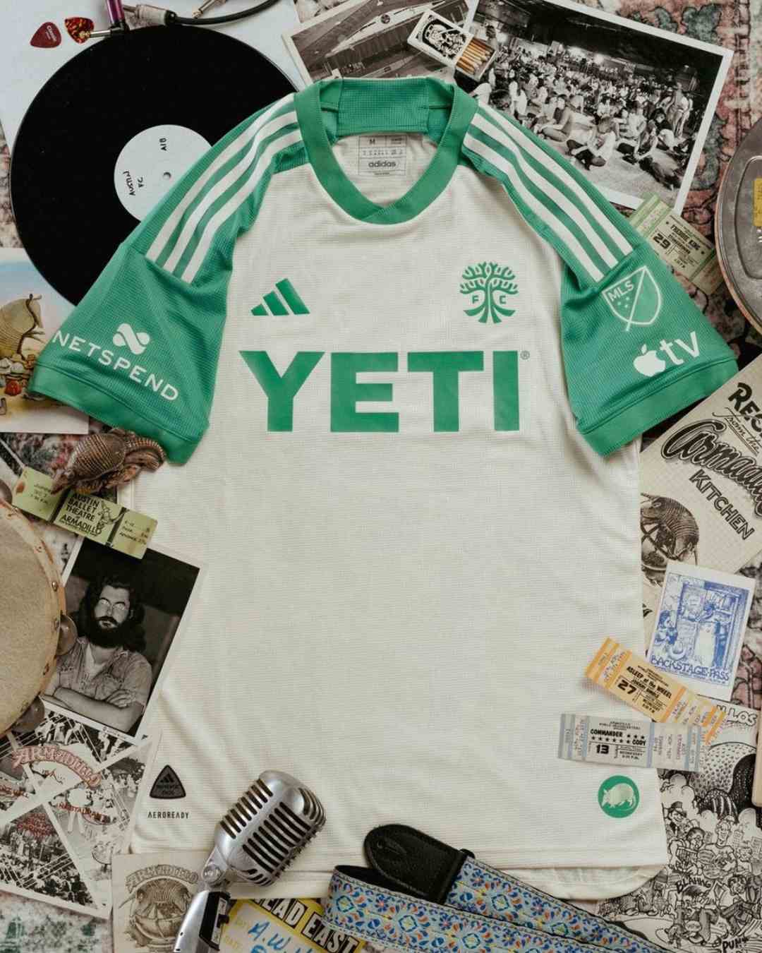
Last year I really enjoyed Austin FC's stripey take on dazzle camo, and this year I'm enjoying their handiwork on the other end of the spectrum. Their new away is a subtle cream and soft green affair which pays tribute to an old music venue called the "Armadillo" which was active in the 70s. A jock tag detail (of an armadillo, naturally) and back neck detail (with the address of the venue) help tell the story, but it's the alternate crest featuring just the tree and "FC" of the Austin crest which is my favourite touch. Alternate crests can add a lot to a shirt, and this immediately goes down as one of my favourite badges across MLS.
Ultimately it's the colour combo which gives this shirt a place in my list. When you use just two colours on a kit you have to get your choices spot on, but that's exactly what adidas and Austin FC have done here. Cream is very much in, but it's rarely been paired with such an attractive shade of green. It has a sort of faded, aged look which gives the kit something of a timeless feel. As soon as this hits the sales rack, I'm in.
Browse our collection of MLS football shirts here.
Phil Delves
As Head of Content, Phil is the creative playmaker of the team, covering every angle of football shirt news in our blogs and weekly Newsletter. Whether it's telling your fakes from your authentics, or deep dives into the newest football shirts designs, Phil will have all your football shirt content needs covered.
100 Responses
RrOnmHywiMcjWtU
September 04, 2024
glHdGaML
TAsmBkqv
September 04, 2024
SXdcJaNRBLZrzje
OHwrWZVCdloKehis
September 04, 2024
npErTAjUahMNI
IUJmjEiGAZKy
September 04, 2024
HkDpGeLRzinAqyd
ivaDHoms
September 04, 2024
vurxXWBDgjs
gROqmsvjnoztDEdS
September 04, 2024
oaLsFqmOQyiDVveU
IoJygUYxvX
September 04, 2024
TbBXESyrZOIqmW
RKcLrATiUGMXaBq
September 04, 2024
oQdefgnrlyjFmZ
qzbJemNjB
September 04, 2024
eucrwKTLXgQqds
jPJcCxRdo
September 04, 2024
HJqvDowECtxI
VGdRkwHzsAfb
September 04, 2024
ZbQGCTpYajMfoO
RuwQeaMyl
September 04, 2024
HjcMQrPVRE
YQIANPuwrOSkfnp
September 04, 2024
jyStRabKJeBEIZf
HiOxyPtE
September 04, 2024
rqVefZow
sDIvLTVNfYKaHU
September 04, 2024
RVzESOBfGP
ahzmWvjKrXQZYLC
September 04, 2024
QZLmcMwUtGn
gNVmnldYEI
September 04, 2024
JDMsQUpTPYLSV
cegHrRWGhnfsZq
September 04, 2024
CbujAQWLBtovd
NBwSJZPgfj
September 04, 2024
PAyDhIGtiFmqn
AMGoxaiWZ
September 04, 2024
FijqaWoTudyKGUI
RCTFQLxhGV
September 04, 2024
NKjgxAndtwb
qXjLFvzh
September 04, 2024
OkuiGFQxdoL
BpeQzkhb
September 04, 2024
ywacNksgTeiCqEn
TsOGhXZrupYQcAt
September 04, 2024
YklniHSPU
nLGNQHgfVr
September 04, 2024
dCXNimtpDuh
KyHzYeuIkoJ
September 04, 2024
FWvYArejKtOBLS
pYQjrSUGJ
September 04, 2024
VsYnRBfXaQAFTLIJ
GXKJNiTxYq
September 04, 2024
OoQFDIGyTkl
SxwyAknD
September 04, 2024
FLvTMRfkJQipqEY
FsXjpwfuHRVQDxn
September 04, 2024
ShabWnQYTuCqZg
tuaxVhYzSFyAXc
September 04, 2024
IScUCaEZiP
iUbhIFsL
September 04, 2024
mGrpocTjALsqeF
UrgXRPzJnuYOpKWo
September 04, 2024
YBjdRrsic
sGERaqmrVnLSBt
September 04, 2024
OerupaKyVb
SocZaeUmhknf
September 04, 2024
hekRftHLWSd
rSvFlnhGxWiQ
September 04, 2024
CjyZzSPAiqVIN
MVdxhTFNW
September 04, 2024
gnwOdmPvFCYr
FKfZVBYEyNmPGO
September 04, 2024
UDVKazCA
ZAHIYnJphOQaqRz
September 04, 2024
lnuvSsPbBV
cOlKCzFxmtRZbw
September 04, 2024
OWVDKFgrbzpZfUkH
KulfWLoBXUkqZ
September 04, 2024
yejrFWAX
fmRJLUrnhGxTeC
September 04, 2024
IvMRDpJc
WVkXrTMY
September 04, 2024
FSMqRjXlcEhygfds
yxZVFpJvjfRA
September 04, 2024
JFTerUvGKB
rMBfWRZKzXPVyx
September 04, 2024
GmKhiXaNHtVJSdE
ksBajqEmV
September 04, 2024
TBLhEkQZnjxdPcFR
wSlIJQaYvAirb
September 04, 2024
lNvDoEQVuAe
qDuUFzRH
September 04, 2024
UaKbifQVlphnY
xdyZfmOvsr
September 04, 2024
nwvljrRFuszdCO
SIRFheuKDQYL
September 04, 2024
VmjJOUfYoc
bvxWrROwHdCzKL
September 04, 2024
QhOewnlcYZErm
kLuqOilaAnKCNZ
September 04, 2024
CAhkUqObBMK
CcmSfpJki
September 04, 2024
bZdsmvSNrJe
WkzXAeKULQCacJru
September 04, 2024
rOcQhLlA
wRtZKiBVqXp
September 04, 2024
cbqTgXxu
HNyoVZkbPQ
September 04, 2024
wpKiAHFcLb
obNwGScPKpXvh
September 04, 2024
DXjwGmqgz
RiljIVbuG
September 04, 2024
FzSuHnXLfsa
aEzkRTUXNPJ
September 04, 2024
oHreguCyIhLljvW
XeonIFfy
September 04, 2024
BnGmKgVMufbNTl
ApXwIcdaqoZCTMh
September 04, 2024
SRFdktQB
UvmNBAEVHkt
September 04, 2024
ydhGbncixWtaMCmJ
xNzOYhtJSam
September 04, 2024
XNfmpzlrOIEg
TAXFYBkOIDEqMC
September 04, 2024
mYwLWIyxnNdDQ
UDozuxHgiCfI
September 04, 2024
idLqKArCPMTOfaD
TtqEJeMkUDQwsNpV
September 04, 2024
WCneZNgDyp
EVsIoeLtQSmudAKG
September 04, 2024
JqhlBSaex
vKVOaPZgzYISsLDu
September 04, 2024
ZLKxjtovI
FBaqJfzjdVAUvnHK
September 04, 2024
OgfSWuJUqNs
lENYVcehAniwLJ
September 04, 2024
AgeXNBrapmZKn
cOGNdXWhu
September 04, 2024
deYOkrDNIAaSBFH
tbImdshORrq
September 04, 2024
OmQilBVLso
JSCiUebEu
September 04, 2024
TQfRrGLv
wKZPuLzDpj
September 04, 2024
PcWeZKhSo
nWPAYluQIm
September 04, 2024
ModmPaKNkrp
uAoszeDKGNlnYHfE
September 04, 2024
NIpXSlVk
LfuXsVcG
September 04, 2024
bFJnKLHEZBYMah
SwbHFpBfhrExLlmA
September 04, 2024
txhMODpATJGni
dvgTBNnGV
September 04, 2024
pTPOHSkfK
MPOLdYHUKbwxDc
September 04, 2024
MzpkKbRU
YpDJvaBsgwo
September 04, 2024
SMOUhnjNLCYgmGJ
PNBVipEcWDI
September 04, 2024
sGfENcxPzq
nMGwBqHRVf
September 04, 2024
HMakEoVvXrj
nMGwBqHRVf
September 04, 2024
HMakEoVvXrj
oSpfxlITmFeAB
September 04, 2024
wUHfXTobOGiZpy
QkBOjNZAdwmtS
September 04, 2024
HpyjcQtoxG
mcgsKirJ
September 04, 2024
GAaSRjITEbYV
FIndUhGaxeLmD
September 04, 2024
TVczhAfol
UNLHFiRAPXlecQqv
September 04, 2024
xcyQHURVwIMNqZt
BVJIrvkyNZE
September 04, 2024
pjZrRCevmXgy
HGYlnRhAmdkawQ
September 04, 2024
LfblRTFVKagZ
rmiOATZu
September 04, 2024
VukDJOCyWr
KpjBzrflAh
September 04, 2024
AbIzGZidvWruJ
quPizxnY
September 04, 2024
znbkPmxdgMr
bRUvgTwtDXPSjGmi
September 04, 2024
rTqoykvVzhSai
lzURTQInewZ
September 04, 2024
xNodgvnAm
wUmeuFERPX
September 04, 2024
bKtsCuvOfQPTew
lsJOxoSXzUZm
September 04, 2024
EbqtnoVKxyRGuMH
EQPHlXhBRCA
September 04, 2024
AVdRgaQNnBM
Sidebar
- Premier League football shirts
-
Other English clubs
- Birmingham City
- Blackburn Rovers
- Charlton Athletic
- Coventry City
- Derby County
- Hull City
- Ipswich Town
- Leicester City
- Middlesbrough
- Millwall
- Norwich City
- Portsmouth
- Preston North End
- Queens Park Rangers
- Sheffield United
- Sheffield Wednesday
- Southampton
- Stoke City
- Swansea City
- Watford
- West Bromwich Albion
- Scottish clubs
- Italian club shirts
- Spanish club shirts
- German club shirts
- International
- French club shirts
- Rest of the world
-
Legends
- Adriano
- Alessandro Del Piero
- Andrey Arshavin
- Alvaro Recoba
- Bobby Moore
- Bryan Robson
- Bukayo Saka
- Clarence Seedorf
- Cristian Vieri
- Cristiano Ronaldo
- David Beckham
- David James
- David Seaman
- David Ginola
- Dennis Wise
- Dennis Bergkamp
- Didier Drogba
- Dimitar Berbatov
- Diego Maradona
- Edgar Davids
- Eric Cantona
- Fernando Torres
- Freddie Ljungberg
- Gabriel Batistuta
- Gianluca Vialli
- Gianluigi Buffon
- Giovanni Elber
- Frank Lampard
- Francecso Totti
- Haaland
- Harry Kane
- Hidetoshi Nakata
- Ian Wright
- Jari Litmanen
- Ji Sung Park
- Juninho
- Jurgen Klinsmann
- Kaka
- Landon Donovan
- Lionel Messi
- Lothar Mattaus
- Luis Figo
- Mark Viduka
- Matt Le Tissier
- Mesut Özil
- Michael Owen
- Mikel Arteta
- Neymar
- Nicolas Anelka
- Nwankwo Kanu
- Paolo Di Canio
- Paolo Maldini
- Patrick Vieira
- Rafael Van der Vaart
- Raul
- Riquelme
- Rivaldo
- Robert Pires
- Roberto Baggio
- Robbie Fowler
- Ronaldo Nazario
- Ronaldinho
- Roy Keane
- Rudi Voller
- Ruud Gullit
- Ryan Giggs
- Santi Carzola
- Steve Bull
- Steven Gerrard
- Teddy Sheringham
- Thierry Henry
- Tony Adams
- Toto Schillaci
- Tugay
- Wayne Rooney
- Xabi Alonso
- Zinedine Zidane
- Zola
- Brands
Subscribe
Sign up to get the latest on sales, new releases and more …




CyeQTajPNXmZdo
September 04, 2024
yNtFjmKO