Recently added
Vintage shirts
Concept kits
Legends
Football shirts are good again
by Phil Delves February 05, 2022 10 min read

Euro 2016 was a terrible tournament. And not just because I’m English.
Yes, defeat to Iceland represented one of the darkest days in our nation’s apathetic history with tournament football. But for me, that fateful match pales in comparison to the terrible exhibition of kits we saw in France just over 2 years ago.
Even the most optimistic of shirt fanatics would struggle to find much to shout about at Euro 2016, where precious few teams attempted anything interesting from a design perspective. For every relatively adventurous shirt like Spain’s ‘Doritos’ away shirt, we had several bland, cookie-cutter kits like Nike’s efforts for France, England and Portugal.
In many ways it was a tournament that represented the worst in the football shirt industry, where templates are trotted out universally in a way which leaves fans disenfranchised and neutrals wondering where it all went wrong. But if 2016 represented the nadir of football shirts, 2018 showed us that we have truly turned a corner.
Nostalgia trip
If we use a tournament again as a barometer for the shirt industry, the World Cup in Russia couldn’t have been much more of a contrast to the Euros. Proceedings were headlined by the fine work of adidas, who doubled down on a retro-tinged approach to kits.
All their ‘big’ nations, from hosts Russia to fallen giants Spain to 2014 champions Germany got the throwback treatment. Instead of simple remake kits however, we had shirts which brought forward classic designs with a more contemporary twist. This led to some absolutely glorious outfits, like Colombia’s home kit which resurrected one of Carlos Valderrama’s best looks from the 90s, and Belgium’s home kit which travelled even further back to 1986 for inspiration.
Some shirts had links which were less specific yet no less satisfying. Alongside Spain’s home kit, we had an away kit which broadly represented adidas in the late 80s rather than a notable Spain kit of the past. Mexico’s away shirt, one of the best of the tournament, looked more like a tribute to the great Hungary team of the 50s than a Mexican shirt.
Throwback to THAT incredible Toni Kroos free-kick in the 2018 World Cup 🤯 pic.twitter.com/xzv1168G9s
— B/R Football (@brfootball) June 23, 2020
My personal favourite of this particular approach was Germany’s away kit, which came close to surpassing the template it was loosely inspired by (the classic, green 1988 away design, also famously worn by Holland).
Considering how the ‘88 kit is revered in the shirt community, adidas’ work in creating a pattern almost as evocative as the original deserves a tonne of credit.
The eagle in the room
Despite this impressive collection of kits from adidas, no single shirt sums up 2018 better than the one that belonged to Nigeria.
The Nigeria 2018 Kit Release 🇳🇬🌟 pic.twitter.com/Hwb9rJ2NQZ
— Classic Football Shirts (@classicshirts) January 15, 2022
The story of the Nigeria shirt is well told, and that first image of Alex Iwobi striking a ball in the kit is one that has pretty much burned into my memory. Though the huge publicity around the shirt was clearly elevated by the clever, drip marketing campaign that supported it, I would argue that Nike actually created a genuinely great kit. This was a design that weaved together several elements to create the perfect storm.
From a design perspective, we had a pattern broadly representing Nike’s first shirt for Nigeria back in 1994. You might remember the template more for it’s time with Borussia Dortmund than the Super Eagles, and it’s a design which encapsulates what made Nike so successful in the early 90s. Then, the luminous shade of green harks back to the World Cup in 2002.
Though the Nigerian team back then made very little impact with just a solitary point to show for their efforts, their shirts were more memorable. It was a perfect fit for the design of the new kit, and yet another example of subtle appreciation rather than direct remake.
Before we get carried away however, we have to jump back to adidas to talk about another fresh design which stands tall as one of the best last year.
Recent Asian Cup finalists Japan are kings when it comes to memorable tournament shirts, with their 1998 vintage and underrated 2006 beauty two personal favourites, and the side were a natural choice for adidas to flex their own creative muscles.
🇯🇵 @adidasfootball continue their 2018 World Cup countdown with the Japan home shirt: https://t.co/wkCH57XUXa pic.twitter.com/XP3JLJY8Pi
— SoccerBible (@SoccerBible) November 6, 2017
The 2018 home shirt boasts a pattern inspired by sashiko stitching, a technique notable for it’s simple yet striking aesthetic. It’s usage across the body of the Japan shirt was sublime, especially in tandem with the recently reworked crest and flag detailing. Other details such as the collar (which cut off perfectly so as not to obscure the pattern) were masterfully chosen, and it all played a part in what was my personal favourite shirt of the year.
There was truly something for everyone when it came to shirts in 2018. Throwback shirts have never been as good, and the creative designs that came out alongside them made for a broad and exciting set of kits.
Double diamonds - 2 brands which stood out in 2018
Nike’s performance in 2018 was a far cry from the aforementioned debacle in 2016. The Swoosh dominated from a shirt perspective from start to finish, and although Nigeria stole the headlines their best work could be found at club level.
I particularly enjoyed their new collection of third kits, which featured unique designs incorporating elements of a team’s city. We had Atletico’s vibrant blue and yellow design, with gradient stripes interlocking across a cityscape, and Tottenham’s effort which featured a subtle line pattern reminiscent of their legendary 1986 hummel shirt, along with a cityscape of their own and shade of green inspired by a local brewery.
This variation on a theme was fantastic, and proof that creativity is far from dead in the industry. It reminded me very much of an initiative which the NBA have been pioneering for a number of years now: City edition jerseys. These special kits tap into the stories and history behind each of a team’s locales, and typically some of the best looks of the basketball year can be found amongst this collection. It’s a trend I expect to see grow considerably in the coming years…
Alongside Nike, Umbro had a brilliant 2018.
Inspired by Prince Rupert's Tower...so what better place to grab a picture! The new @Everton 2018/19 third shirt #EFC
— Umbro (@umbro) August 24, 2018
🛒 Shop: https://t.co/xuJixNzRhf pic.twitter.com/GDW12ph5Ev
There were countless highlights in the Umbro portfolio, but my favourite designs were found close to home with the likes of Everton and West Ham. It all starts with the cuffs, an often underappreciated part of the shirt, which Umbro took to new levels thanks to a look dripping in their signature double diamonds. The pattern which went around the end of the sleeves was magnificent. I also enjoyed many of their colour choices, such as West Ham’s away kit which featured a slightly unusual but very attractive combination of blue, maroon and gold.
They were far from a one trick pony however. At the World Cup Peru were many people’s second team before the tournament even started thanks to their glorious sash shirts. Other shirts such as those of Brazilian giants Grêmio and Cruzeiro completely stole the show as they made the rounds on Twitter, and it quickly became a given that if Umbro were releasing a new shirt, it was going to be a beauty.
This sort of consistency put almost everyone else to shame.
Unbalanced - 2 brands which disappointed in 2018
Of course for every brand who exceeded expectations, there are those we failed to make the most of their contracts.
As strange as it is to say after praising their national team kits, I have to mention adidas in this category due to their largely underwhelming club kits. There were some exceptions, with teams like Bayern Munich getting the full attention of the three stripes, but elsewhere we saw an embarrassing saturation of templates across several teams.
Templates are not inherently an issue when used sparingly and across no more than 2 or 3 teams from one nation, but adidas came under some justified slack for one template in particular which went far beyond this accepted remit.
The Condivo 18 template, in England alone, was used by Birmingham, Cardiff, Fulham, Ipswich, Leicester, Sheffield United, Sunderland, Watford and Wolves. This was on top of countless other major clubs across Europe and beyond, not to mention national teams like Belgium, Sweden and Egypt.
To rub salt in the wound, many fans complained at the approach adidas took to the back of their striped shirts, opting for a full colour block in order to comply with regulations around name and number visibility. Of course, people were quick to point out that there are more creative ways to comply with regulations without sacrificing the integrity of a design so clearly, and though some would argue that this is an example of fans being picky I would very much side with the fans and suggest that attention to detail makes all the difference when it comes to a shirt.
Next up in the ‘must do better’ category are New Balance.
Two season ago in 2017, the brand could do little wrong as everything they touched turned to gold with a range of stunning shirts for the likes of Liverpool, Celtic and Porto. For Celtic in particular, their home, away and third shirts commemorating the “Lisbon Lions” were easily some of my favourites across all brands.
However in 2018, I would argue that Celtic’s home kit was worse in every way to the year before. Of course it’s hard to follow a good kit and freshen things up, but several details look comparatively rushed and messy. The subtle tartan pattern, a lovely idea, is poorly executed in the way it breaks across the hoop pattern inconsistently. The breakup of the hoops for the underside of the sleeves looks clunky, and the one-button collar is unnecessary.
The brand also fluffed on an opportunity to make a splash at the World Cup with a couple of relatively drab home and away kits for Panama and Costa Rica respectively. 2018 showed more than ever that a strong shirt can help raise the profile of a nation considerably, but in contrast to what we saw from many other nations New Balance’s teams were quickly forgotten.
I expected to see New Balance kick on and build on their successes, but for me they are in danger of falling too far behind especially when you consider how well brands like Umbro have been doing.
2019 Predictions
I’m very positive about the state of play for kits this year. 2018 pushed boundaries in a way which we haven’t seen for a long time, and as a result we can expect brands to continue to break new ground.
After seeing the largely positive reception that adidas received for their World Cup kits, you bet everyone else will be trying to create a similar buzz of their own. It’s heavily rumoured that Nike will dip their toes into the retro pool, even bringing back their old-school logo which included both their logo and wordmark. This would no doubt be a hugely popular move, and if they can also freshen up some of their popular designs from the 90s we could be in with a real treat.
Another thing to watch out for is the development of the mash-up kit. We’ve seen occasional, one-off mash-up kits in the past (usually to celebrate a club birthday) and it wouldn’t be a surprise to see these grow in usage.
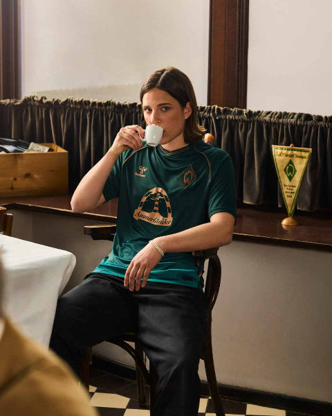
Two things in particular have made me take notice. Both Werder Bremen and Inter Milan are set to wear their own mash-up kits in competitive games this season, as opposed to reserving them for pre-season or pre-match only. Any time you see a kit worn on the pitch it automatically gives it more legitimacy, and if the reception to these kits is positive we are much more likely to see similar designs in future.
I was also impressed that the new Werder Bremen kit (celebrating 120 years of the club) has actually been stitched together in various panels, rather than simply having a pattern printed on. This method is a far cry from the direction shirts have been heading for a while, with fewer and fewer panels, so we could see more shirts achieving bolder and bolder patterns by actual construction rather than simply sublimating designs.
Finally, except brands to grow in the areas of sustainability and collaboration. With sustainability, we are now used to shirts like the ones adidas have been introducing through their partnership with environmental organisation Parley. Not only do all their major teams boast sustainable third kits this season, MLS have been a pioneering an initiative where all teams are given special kits for one week to help raise awareness of the dangers of ocean pollution.
The benefits of this are obvious, and although there are considerable logistical challenges in coordinating the same sort of campaign where there might be several different brands involved in one league (unlike MLS where all teams are supplied by adidas), I wouldn’t be surprised if other leagues tried to do their own bit to champion causes which affect us all.
Then, on the collaboration side it’s very likely other clubs will look to get a slice of the pie that PSG have been enjoying since the launch of their partnership with Jordan. Whatever you think of the move we know that nothing talks more in the industry than money, and assuming that the collaboration has been a success for Neymar’s employers, other big clubs will no doubt seek their own opportunities. In terms of who that club will be, I’m looking to the likes of Juventus who would be wise to cash in on the attention they now have because of a certain Portuguese player, whilst he is still performing at a high-level.
Enjoy the ride
We’ve come a long way since 2016. When people tell you that the shirt industry is just a production line of templates designed to simply turn a profit, challenge them with the facts of what we are seeing this season.
Of course there are still instances of brands who cut corners and keep things frustratingly vanilla, but there are many more examples of genuinely beautiful football shirts which showcase what is possible when a little bit of creativity is mixed in to the bowl.
I’m pretty sure we’ve never had it better this side of the millennium, so let’s enjoy the ride.
Speaking of football shirts being good again, why not checkout our range of Modern Classic football shirts. Featuring clubs from all around the world, you can browse some of the best kits in the game right now here.
Phil Delves
As Head of Content, Phil is the creative playmaker of the team, covering every angle of football shirt news in our blogs and weekly Newsletter. Whether it's telling your fakes from your authentics, or deep dives into the newest football shirts designs, Phil will have all your football shirt content needs covered.
Leave a comment
All teams
- Premier League football shirts
-
Other English clubs
- Birmingham City
- Blackburn Rovers
- Charlton Athletic
- Coventry City
- Derby County
- Hull City
- Ipswich Town
- Leicester City
- Middlesbrough
- Millwall
- Norwich City
- Portsmouth
- Preston North End
- Queens Park Rangers
- Sheffield United
- Sheffield Wednesday
- Southampton
- Stoke City
- Swansea City
- Watford
- West Bromwich Albion
- Scottish clubs
- Italian club shirts
- Spanish club shirts
- German club shirts
- International
- French club shirts
- Rest of the world
-
Legends
- Adriano
- Alessandro Del Piero
- Andrey Arshavin
- Alvaro Recoba
- Bobby Moore
- Bryan Robson
- Bukayo Saka
- Clarence Seedorf
- Cristian Vieri
- Cristiano Ronaldo
- David Beckham
- David James
- David Seaman
- David Ginola
- Dennis Wise
- Dennis Bergkamp
- Didier Drogba
- Dimitar Berbatov
- Diego Maradona
- Edgar Davids
- Eric Cantona
- Fernando Torres
- Freddie Ljungberg
- Gabriel Batistuta
- Gianluca Vialli
- Gianluigi Buffon
- Giovanni Elber
- Frank Lampard
- Francecso Totti
- Haaland
- Harry Kane
- Hidetoshi Nakata
- Ian Wright
- Jari Litmanen
- Ji Sung Park
- Juninho
- Jurgen Klinsmann
- Kaka
- Landon Donovan
- Lionel Messi
- Lothar Mattaus
- Luis Figo
- Mark Viduka
- Matt Le Tissier
- Mesut Özil
- Michael Owen
- Mikel Arteta
- Neymar
- Nicolas Anelka
- Nwankwo Kanu
- Paolo Di Canio
- Paolo Maldini
- Patrick Vieira
- Rafael Van der Vaart
- Raul
- Riquelme
- Rivaldo
- Robert Pires
- Roberto Baggio
- Robbie Fowler
- Ronaldo Nazario
- Ronaldinho
- Roy Keane
- Rudi Voller
- Ruud Gullit
- Ryan Giggs
- Santi Carzola
- Steve Bull
- Steven Gerrard
- Teddy Sheringham
- Thierry Henry
- Tony Adams
- Toto Schillaci
- Tugay
- Wayne Rooney
- Xabi Alonso
- Zinedine Zidane
- Zola
- Brands
Subscribe
Sign up to get the latest on sales, new releases and more …


