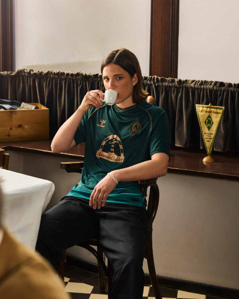


The latest edition of the Copa América is in full swing, and a number of shirts have caught my eye.
Chile’s new home shirt, expertly showcased by Stoke-born, Blackburn Rovers-based Benjamin Anthony Brereton, is a highlight, despite the ongoing dispute between the team and Nike which has seen the swoosh covered by a patch on the shirts. New designs for the likes of Argentina and Brazil are getting their first tournament exposure too, with both sides looking in top form during the early stages of the tournament.
The shirt story of the Copa América so far comes courtesy not of Brazil, Argentina, or Chile though. It comes from a nation who are no strangers to a good football kit; Peru.
For as long as Peru has played football, the team have looked beautiful. Apart from River Plate, no other club or country have been as loyal to the sash, and there is simply an incredibly high floor when it comes to Peru shirts, with even the ‘worst’ looks standing tall above most other international shirts.
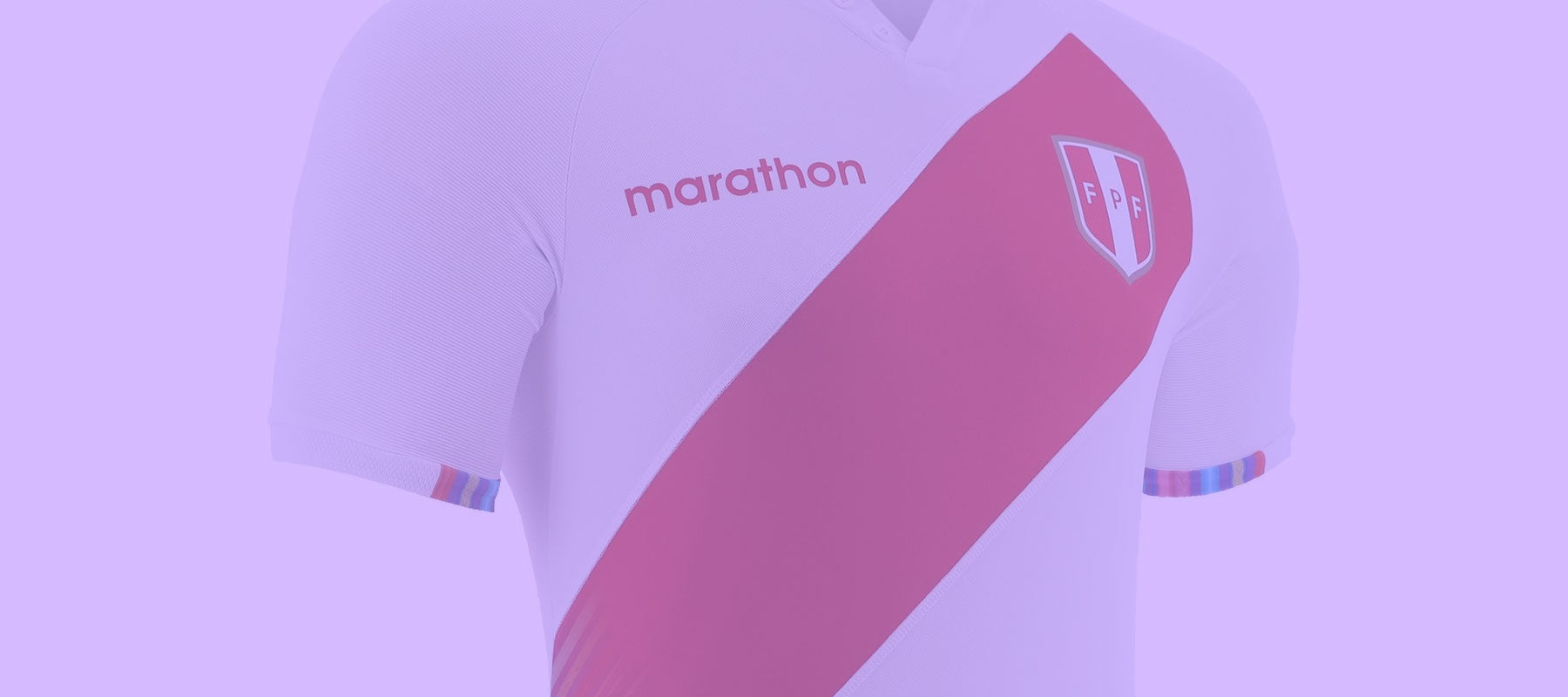
Many people would argue that every Peru shirt looks the same, but in 2021 Marathon Sports have produced a magnificent take on the iconic Peru look.
Peru shirts look the same every ye... wow. pic.twitter.com/aTiNqGP2co
— Football Shirt Collective (@thefootballsc) June 11, 2021
The classic red sash is here, but a number of exciting additions to the look move things up a gear. A series of multicoloured lines appear like light streaks from the bottom end of the sash, and the colourful motif is replicated on other areas of the shirt including the cuffs and bottom hem.
Far from being a random addition, the aesthetic is a nod to the famous Vinicunca or Rainbow Mountain, a popular destination characterised by an incredible, almost other-worldly array of colours. A further surprise can be found as you zoom in to the lines, with intricate patterns visible within some of the streaks.
A brilliant patch featuring a weave of colours in the outline of Peru and the words “Unidos por nuestros colores” (United by our colors) tops things off in the best possible way.
It’s easy to get carried away with a source of inspiration, but the execution from Marathon here is textbook. The design is respectful to Peru’s history, whilst also bringing an exciting element that actually has a clear connection to the country.
.@marathonsports_ putting themselves on the map this year. pic.twitter.com/yW5iidPLuj
— Phil Delves (@phildelves) June 21, 2021
Based on this evidence, I’d be very happy to see more of Marathon in Europe. They’ve certainly put themselves on the radar with the 2021 Peru home shirt.
Add a vintage international shirt, including some Peru classics, to your collection today. Browse them all on our marketplace here.