Recently added
Vintage shirts
Concept kits
Legends
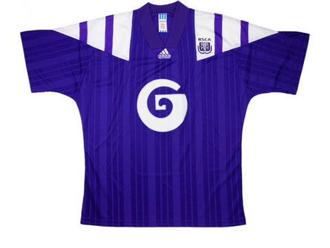
1992 Anderlecht Away Shirt
by Phil Delves February 28, 2022 3 min read

FSC Approved - 1992 Anderlecht away shirt
The adidas equipment era was undeniably one of the brightest periods of football shirt history. In the wake of the legendary Holland and Germany designs of the 80s, adidas kept the ball rolling with a range of shirts that played hard and fast with their iconic three stripes. The timing couldn’t have been better, and with more and more eyes on the beautiful game (thanks in part to memorable tournaments like USA ‘94 and the formation of the Premier League) adidas capitalised in the best possible way.

One of my favourite things to do is to look back on the adidas EQT years and discover designs which have flown somewhat under the radar. Many of the famous early 90s adidas templates were used for a wide variety of teams and sometimes the sides outside the biggest leagues tournaments boast versions of a template that are as good, if not better, than their more famous counterparts.
With that in mind, I offer up to you Anderlecht.
Now, it would be unfair to call Anderlecht a ‘small’ side given that they’ve won more Belgian league titles than any other club (by a long way), but in my experience their name doesn’t come up nearly enough when discussing the adidas equipment years.
The Anderlecht x adidas partnership was extremely long and beautiful, starting out in the 70s and running right through to the 2018/19 season. As adidas flourished in terms of shirt design, so too did Paars-wit, and their back catalogue reads like a ‘best of’ album for adidas kits.
I could choose any number of adidas EQT Anderlecht shirts to highlight, but I’ll zero in on the 1992/93 away shirt today.
This particular template (also used by France, amongst others) is perhaps not as popular as the diagonal, over-the-shoulder look that Marseille employed for their Champions League victory, but the design was just as impactful in my eyes.
With two sets of the three stripes reaching down both shoulders, there was a bit of a gladiator or centurion aesthetic. The armour look is further reinforced with groups of subliminal stripes which can be seen throughout the body and sleeves.
The Anderlect version of this template moves up a gear though by sticking to a rigid two colour colourway. I absolutely love it when a shirt design is confident enough to utilise just two colours across the entire kit, and even the club crest sits entirely in purple. Shirts with understated colourways tend to age particularly well, and of course with a combination as distinctive as the purple and white of Anderlecht, this has all you need.
A word on the sponsor too. Like the magnificent Die Continentale ‘C’ seen on 90s Borussia Dortmund shirts, the swirly logo of Anderlecht’s partner Société Générale is a sight to behold. On the home shirts, the sheer size of the bank’s logo with the red background dominated designs in an unfortunate way, but by contrast the away shirts boasted a more refined, backgroundless white look.
The swirl was still massive, but without the red the overall look was considerably better. I particularly appreciate the fact there are no words to clutter proceedings with this particular logo too, and again it reminds me very much of Dortmund shirts which utilised the alternate Die Continentale logo with just the ‘C’ to great effect.
So, next time you’re reminiscing about the glory days of adidas EQT, consider the purple and white of R.S.C. Anderlecht.
We have a 1992 Anderlecht away shirt in stock at the moment, so if this article has piqued your interest, you know what to do. Pick it up here.
We also have a collection of modern Anderlecht shirts, which you can view in our Modern Classics collection here.
What is FSC Approved?
What makes a football shirt good? It’s a purely subjective question, right?
Whilst there are indeed a lot of subjective elements when it comes to shirts, there are still factors to consider. Sometimes, a design is notable for its unique aesthetic. The colourway, pattern or construction may have gone where no shirt dared to go before it, or it might simply be a particularly good utilisation of a classic approach. Other times, a legendary player elevates a design to immortality, even if the design in question would’ve been hard to pick out of a crowd before.
Our series FSC Approved will be a lovingly curated list of shirts that deserve to be in the conversation as good, possibly even great football shirts, no matter who you support or what your taste in shirts is. Old classics, new contenders, if it’s FSC Approved it’s as close to a certified banger as you can get.
Phil Delves
As Head of Content, Phil is the creative playmaker of the team, covering every angle of football shirt news in our blogs and weekly Newsletter. Whether it's telling your fakes from your authentics, or deep dives into the newest football shirts designs, Phil will have all your football shirt content needs covered.
Leave a comment
Sidebar
- Premier League football shirts
-
Other English clubs
- Birmingham City
- Blackburn Rovers
- Charlton Athletic
- Coventry City
- Derby County
- Hull City
- Ipswich Town
- Leicester City
- Middlesbrough
- Millwall
- Norwich City
- Portsmouth
- Preston North End
- Queens Park Rangers
- Sheffield United
- Sheffield Wednesday
- Southampton
- Stoke City
- Swansea City
- Watford
- West Bromwich Albion
- Scottish clubs
- Italian club shirts
- Spanish club shirts
- German club shirts
- International
- French club shirts
- Rest of the world
-
Legends
- Adriano
- Alessandro Del Piero
- Andrey Arshavin
- Alvaro Recoba
- Bobby Moore
- Bryan Robson
- Bukayo Saka
- Clarence Seedorf
- Cristian Vieri
- Cristiano Ronaldo
- David Beckham
- David James
- David Seaman
- David Ginola
- Dennis Wise
- Dennis Bergkamp
- Didier Drogba
- Dimitar Berbatov
- Diego Maradona
- Edgar Davids
- Eric Cantona
- Fernando Torres
- Freddie Ljungberg
- Gabriel Batistuta
- Gianluca Vialli
- Gianluigi Buffon
- Giovanni Elber
- Frank Lampard
- Francecso Totti
- Haaland
- Harry Kane
- Hidetoshi Nakata
- Ian Wright
- Jari Litmanen
- Ji Sung Park
- Juninho
- Jurgen Klinsmann
- Kaka
- Landon Donovan
- Lionel Messi
- Lothar Mattaus
- Luis Figo
- Mark Viduka
- Matt Le Tissier
- Mesut Özil
- Michael Owen
- Mikel Arteta
- Neymar
- Nicolas Anelka
- Nwankwo Kanu
- Paolo Di Canio
- Paolo Maldini
- Patrick Vieira
- Rafael Van der Vaart
- Raul
- Riquelme
- Rivaldo
- Robert Pires
- Roberto Baggio
- Robbie Fowler
- Ronaldo Nazario
- Ronaldinho
- Roy Keane
- Rudi Voller
- Ruud Gullit
- Ryan Giggs
- Santi Carzola
- Steve Bull
- Steven Gerrard
- Teddy Sheringham
- Thierry Henry
- Tony Adams
- Toto Schillaci
- Tugay
- Wayne Rooney
- Xabi Alonso
- Zinedine Zidane
- Zola
- Brands
Subscribe
Sign up to get the latest on sales, new releases and more …


