


This year Umbro celebrated their 100th year anniversary. Given the competitive, cut-throat nature of professional sports it is no small thing for a brand to stick it out for a century and counting, and the Double Diamond have been a welcome presence in the game throughout their history.
Sadly however Umbro are not immune to the age-old problem of fakes. The popularity of the brand and their superb output from a design perspective has put more than a few scammers into action, and if you’re looking to pick up an Umbro classic you’ll need to be accordingly vigilant.
Here are some tips to help you on your way, with a special shoutout to community member Harry Powell who provided photos and assistance with this article!
If you’re looking for help with how to spot a fake Nike football shirt or a kit from another major brand, check out our other guides at the links below.
| adidas | Nike | Puma | General |
The Double Diamonds of Umbro are a staple in football, and as with any other brand you can look at the manufacturer logo on any kit as one of your first ports of call.
What makes the Umbro conversation a little tricky is that their logo has changed look several times. Many of these changes have been quite subtle, but you’ll need to be familiar with whichever Umbro logo was in use for the year your shirt comes from in order to help identify potential fake shirts.

Note that the image above does not refer to the fact that all shirts from the given period will include the exact logo, but rather that Umbro were using the particular logo during a period.
So, for example if you’re lucky enough to own or have the chance to own an Umbro shirt from as early as the 1960s, you’re looking for the filled in red diamond in the middle (note: Umbro have also brought back a version of this classic for some shirts this season!).


For 80s Umbro shirts, you’ll see the introduction of the “umbro” wordmark. The key here is not just the additional word but also that the letters themselves are lowercase. This contrasts to shirts from the 90s where Umbro would adopt the all uppercase logo (and even removing the diamonds on the front of the shirt, as in the case of the Brazil 1994 shirt for example). The letters themselves were also quite chunky during the early-middle part of the decade, before both the letters and the diamonds slimmed down at the end of the 90s.

Towards the end of the 10s, ahead of the immensely popular ‘Tailored by Umbro’ era which remains one of the best moments in football shirt history, the edges of the diamonds were rounded off in a fairly significant logo update by the brand’s standards. This was followed by the reintroduction of the lowercase letters; a look which has essentially remained the same up to the present day.
So, check the Umbro logo on your shirt to make sure it is roughly in line with the logo history timeline above. Once you’re satisfied with that be sure to do the usual sorts of checks for any fake shirts. Are the diamonds nice and crisp? Are the letters uneven or spaced awkwardly? Time and time again the brand logo is one of the key areas in identifying fakes.
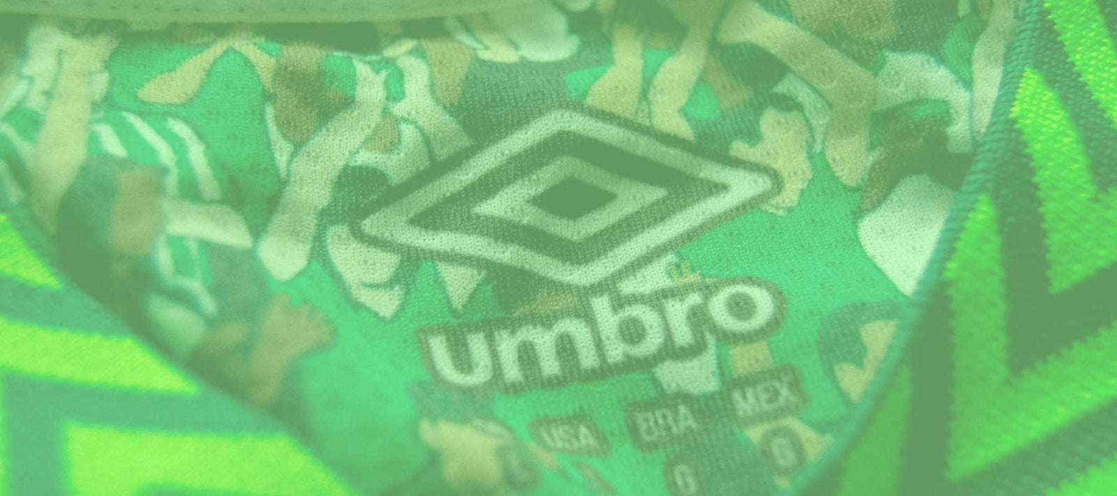
Another key area to look at is the main inside label of your Umbro shirt. Like the Umbro logo itself, the look of these inside labels has changed over the years.


For some periods such as the early 90s we had the memorable “RepliKit” label, which was one of the more distinctive looking labels featuring the Umbro logo, multi sections of additional text and the crest of the club/nation.
Browse our collection of vintage Inter Milan shirts here
Note that not all genuine Umbro shirts from this period will include the team crest, even though it is often seen. The backside of this label should have a blurb regarding colour-fast dyes, and an additional, longer but thinner white label underneath.

Later in the 90s, Umbro switched to large blue labels with much less clutter than the “RepliKit” era. This label design featured a single, large Umbro logo (with all caps writing) and size information at the bottom. Curiously, South American issues of some Umbro shirts from this period have white labels instead of blue.


Moving into the 00s, the blue label was maintained with some subtle tweaks including the removal of the size on the front. However, a more detailed white label directly underneath the blue one contained all the necessary info. The label was then abandoned completely during the mid 00s in favour of a much less durable printed label.
At various points throughout Umbro’s history additional tags/labels have been included. For example, the chunky, baggier Umbro shirts of the late 90s/early 00s commonly feature a “Vapa Tech” label on the outside of the shirt.

This detail evolved into a more substantial jock tag on the front of the shirt, which featured a hologram and additional information including the year of the shirt.

As something of a new addition for our fake spotting articles, here are some practical examples of fakes that have been spotted in the wild, with notes on how to tell they are fake.

We start with a true classic in the fake spotting genre. As soon as you see a shirt rendered inside this particular cage, move on. The background is a popular choice for mockups and fake shirt listing in particular, so unless you’re looking at a concept kit it’s an immediate red flag.
Notice too the price of this particular eBay listing, which is far too low for a shirt of this rarity. The fact that there are 3 of the shirts available is a warning sign (it is extremely rare to have multiple vintage shirts available from one given seller of the same size, unless it is a retailer or the shirt is part of a deadstock drop or similar).
To top it all off, the seller has minimal sales history and 0 feedback.

There are a whole article’s worth of errors with this Liverpool fake. The price is the first obvious sign, but notice the inside red label which is more like something you’d expect to see from a club-issued retro remake than a vintage shirt. Just as egregious is the incorrect modern swing tag, which can be seen in a product video of the shirt (you shouldn’t expect to see tags at all for 80s shirts, unless you’re paying a hefty premium for the privilege). Though harder to spot at first, the Umbro logo is also incorrect for the time (it should be chunkier and have sharper edges).

Ending on a real doozy, join me in laughing at this attempt at a Brazil 1994 shirt. Whenever you see a listing that’s ‘accidentally’ covering the brand logo, assume it’s a fake. As this area is one of the most important when identifying counterfeits it’s an obvious thing to hide if you’re trying to sneak a dodgy kit through.
Of course the design of this shirt is all over the place, but the lack of a proper inside label is a particularly notable omission, as is the state of the Brazil crest.
| All | Arsenal | Manchester United | Liverpool |