


The best football shirt designs are the ones which catch you by surprise. By now, we all know that the likes of Arsenal can rely on a retro makeover of their 90s classics, while the Manchester United's of the game are given three bespoke designs from manufacturers each season.
But as for the rest, those clubs outside the elite of world football from a commercial point of view, they must rely on different more inventive methods, and every now and again this leads to a design breakthrough, something that is unequivocally original and new. Think Minneapolis’ dazzle camo or the eye-catching colours of Venezia in the last couple of seasons.
The most recent addition to this list of Modern Classics has been the FC Nordsjælland shirts. Beginning with a pinstriped red and yellow home shirt, then adding a simple but stunning Pride shirt, and finishing off with a yellow away shirt sublimated with bespoke patterns and symbols, the output from the Farum-based team has been outstanding this season.
We have already given you an insight into the team’s brief, but dense, history, and now that we are releasing the full collection of the club’s 2021-22 shirts, we wanted to focus solely on the jerseys. Once again we were lucky enough to speak with the club’s Head of Marketing, Sebastián Morúa Hernandez, who took us through what each of these shirts means, and the design processes that went into them.
Q: Hi Sebastián, thanks for speaking with us! So, FC Nordsjælland underwent a rebrand several years ago, which seems to have kickstarted the creation process for this season’s shirts. What was that process like?
A: It’s been very cool, it was a great learning experience for me and the club. When we first arrived in Denmark, I think that we understood that everyone was not necessarily connecting with the Right To Dream (the club’s owners) concept immediately, so we wanted to create a moment that kickstarted a fresh beginning.
Another reason for the rebrand was that there was a club in the USA, Princeton FC, who had basically stolen our branding. They literally just ripped it off, with the same logo as our old one, the same font, shape, everything.Then instead of the ‘N’ at the end of the ‘FCN’ they used a ‘P’, and that was it. They used the same designer.

So when we arrived and I saw that, I thought ‘this will never help us to build a strong brand’. Also, this was something that we had allowed to happen, and what sort of message does that send? So that is why we decided to rebrand FC Nordsjælland: For a fresh start and to give us a unique brand identity. We were about to embark on a journey of changing how the club operated, and a rebrand seemed like the best place to start for that.
Q: What were the steps in completing that rebrand?
We engaged a brand from Costa Rica. We wanted someone very neutral to the club, but who also had some understanding of our world. Pupila are an international studio who work with large brands around the world so we knew the quality of their work.
We flew them to Ghana and to Denmark and they spent a week in each place, which allowed them to do their research on the ingredients that would go into both rebrands for Right To Dream and FC Nordsjælland.
Q: Their work clearly speaks for itself. Can you tell us the thinking behind the rebranded crest? The star above it, for example?
A: The result that we see today was the first concept they presented, because we loved it straight away.
If you look at the star at the top of the crest, it’s like a ‘person-star’. That is the Right To Dream logo, and it is shaped like that because we want to communicate that the kids in our academy can become stars. So it represents their journey to transform themselves into the best version of themselves.
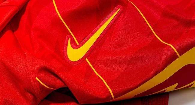
4️⃣. The swoosh & crest 🛡
— Football Shirt Collective (@thefootballsc) October 18, 2021
The Nike swoosh and club crest on the 2021 FC Nordsjælland shirts match any other kit you’ll see on the market today.
The raised details on the crest look outstanding, the treatment of the swoosh is better than most top tier teams.
[THREAD 📖] pic.twitter.com/hgHCNmXnRz
The reason we use the Right To Dream logo above the club logo is to symbolise that we are a purpose driven movement. In Denmark you can only put a star at the top of your badge once you win 5 leagues, and we have only won one so far. So when we did that we were very aware that people would say ‘why are you doing that if you haven’t won 5?’. But our answer to that is that this is not a star, but it is the Right To Dream logo. And even if we go on to win 10 Championships, we’re not going to put two stars above our crest, because we belong to the Right To Dream movement that the current star represents.
Q: And given the way some fans can react to rebrands, was it important to include elements of the old branding as well?
A: Yes. If you look at the old logo, it’s a tiger leaning on a football, with its head kind of low. We decided to go with a tiger that is roaring directly at you, ready to attack, and that was a decision that came directly out of our style of play and identity on the pitch.
It’s a funny story about the tiger, because the tiger has no particular meaning in Denmark or for FC Nordsjælland, but the previous owner was just obsessed with tigers. So he picked it as a mascot and people loved it. Also, the tiger is the biggest cat in the cat world, and FC Copenhagen - one of our biggest rivals - has a lion, so it’s kind of like ‘yeah you have the bigger club, but we have the bigger cat’.
The shape of the badge is actually a combination between the old FCN badge and the old Farum club (the club which came before FC Nordsjælland’s creation). The old FC Nordsjælland badge used to be square, like the top of the crest, and the Farum badge was a shield, which is shown in the bottom part of the current crest.
And ultimately, this season’s home jersey is a tribute to 2003, when the club was created. Last year we launched a tribute to our grassroots club via our 3rd shirt. It was a navy shirt with bordeaux and mustard colours running through the middle which were the original colours of Farum. People loved it so much that we actually ended up using it more as an away shirt.
We started that journey last year with our fans in order to take them through our history and mainly as a vehicle to bring back the best moments and introduce those to some of our new fans. 50% of our fan base is over 60, and the remaining are mainly kids and young people. So we are missing that middle section. So we started talking about our history a little bit more to get these people involved, and we are doing that not just through content, but also through our jerseys.
We started with the tribute shirt to our grassroots club. Then the next milestone was the creation of FC Nordsjælland and the change in our colours from mainly yellow and red, to mainly red and yellow, while also dropping the blue and adding the tiger.
Q: What input did the club have on the new season’s kit design?
A: The shirt is all our design. We have a great relationship with Nike, I think they like us because we are a bit different, and this is a privilege that many clubs around the world who are sponsored by Nike are not given.
There are different ways of doing it with Nike: 1) you have a global deal, like Spurs, Barcelona, Chelsea, where you get bespoke textiles and designs. 2) You take the shirts from the team catalogue, and then suppliers who are approved by Nike take the plain shirts and design a shirt like the one we ended up with for 2021/22. We used this option, and chose a park jersey, which is one of the simplest jerseys in the Nike catalogue.
Q: What was the design process like after you received the plain shirts?
A: So when we received the home shirt it was just plain red with a white Nike swoosh. Then with our design team, and the ideas that we have for today’s jersey and the Nike approved suppliers, Redville, based in Holland, we all came together and tried to bring the different ideas into the shirt. Redville then told us what is possible and what isn’t.
With this jersey we decided to go with a simple cut, much like a plain t-shirt. We did that because we knew we wanted to add quite a few elements to the jersey, so we thought ‘let’s keep the jersey simple so that the elements can pop a little bit more’.
5️⃣. A club with a purpose🏳️🌈
— Football Shirt Collective (@thefootballsc) October 18, 2021
FC Nordsjælland are a club driven by a desire for social change. That is reflected in their off the field efforts to ensile values in all of their players, and also on the pitch, with this season’s Pride shirt.
[THREAD 📖] pic.twitter.com/jdwdsMGNY7
Q: And what about the concept behind your away and Pride jerseys?
A: The Pride shirt is very clean and plain but with a few really cool details, especially the iridescent features. It’s again about the message. We want to make Pride about anyone being able to be who they are. We felt that in football in particular, the way Pride is often perceived is about the extravagance, and we wanted to bring a slightly different message about finding you light and being who you are. We think that this jersey does this.
We are going to have a workshop as well to get kids to paint on the shirt. So the message will be ‘how will you put your spin on the shirt and Pride’.
The away shirt is something we are really excited about because it was a tribute to our academy locations. It is a yellow jersey, so that will be nostalgic for some fans because we used to play in predominantly yellow. It is basically designed with patterns running down three stripes, and the pattern is made of three symbols, which each link to one of the Right To Dream locations in Denmark, Ghana and Egypt.
Our design team created the striped pattern out of these three symbols, and we see it as an opportunity to also tell the Danish people about the Right To Dream story. A lot of people think that FCN owns Right To Dream, or that it is just a transactional thing where we go and find kids in Africa, which neglects the fact that we provide scholarships, education and everything else.
#DareToBe 🏳️🌈
— FC Nordsjælland 🐯 (@FCNordsjaelland) August 9, 2021
In 2019 we launched our first ever edition of our pride jersey. This season we’re back with a new design:
Iridescent Pride | An invitation to find your light, push the boundaries and show all your colors ❤️@The_Kitsman pic.twitter.com/rs7LgPdPHW
So, the home jersey is very much about the club itself, and the away will be about unifying cultures, which is the name of the shirt.
Q: And we need to talk about the pinstripes on the home shirt. It’s such a distinctive design on that home shirt!
A: We used to have thick stripes for our jersey like Barcelona, but yellow and red. But when FC Nordsjælland was created, red became our prominent colour. So when you see on our 2021-22 home shirt the thin yellow lines, that is us trying to show that the yellow is going away and the red is taking over. And the tiger is also taking over with the print in the background.
If you play with the jersey, the way we placed the sublimations, when you move it in the light it kind of looks like a tiger moving , like when it is hinting. We thought that would be a cool effect to play with on the pitch and have a little fun with the optics.
The other detail is on the inside of the neck. That says “On 2003, I’ll never forget this day.” That is one of the main verses in one of the main songs that our fans sing. The song actually starts “We come from Farum Ball klub” and we put that line in the tribute jersey last season, so now we are carrying on with the next line this season.
Q: What has the reaction been like to the shirts so far?
A: It has been great! We sold out in the first two games. We sold what we usually sell in a year in the first month for the home shirt. We have never seen something like that, and it shows that if we put effort into the design and create something that has real meaning behind it, as well as being aesthetically appealing, then fans around the world will respond to it.
We’re very pleased with it, DHL of course is very pleased with it. We’re excited now because this is the first year we have been able to modify our jerseys with Nike in this way. We’re excited for the potential of this, and now we know what we can and can’t do with the design, we are better prepared for next season.
Thanks to Seb for taking the time to speak with us once again!
If you want to pick-up your own FC Nordsjælland shirt, head over to our Modern Classics collection here.