100% authentic | Shipped from UK | Rated Excellent on Trust Pilot
Your Cart is Empty
Tax included. Shipping calculated at checkout.
Featured
2021-22 FC Nordsjælland
Nasa Concept Club
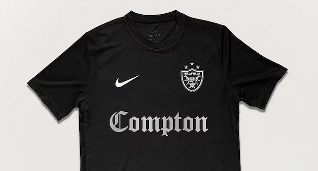
FC Killa Villa
Add description, images, menus and links to your mega menu
A column with no settings can be used as a spacer
Link to your collections, sales and even external links
Add up to five columns
by Phil Delves March 20, 2024 4 min read
by Phil Delves March 09, 2024 3 min read
by Phil Delves February 29, 2024 2 min read
by Phil Delves February 24, 2024 4 min read
by Phil Delves February 11, 2024 3 min read
by Mike Maxwell February 04, 2024 1 min read
by Phil Delves January 27, 2024 3 min read
by Phil Delves January 18, 2024 3 min read
by Phil Delves December 11, 2023 3 min read 2 Comments
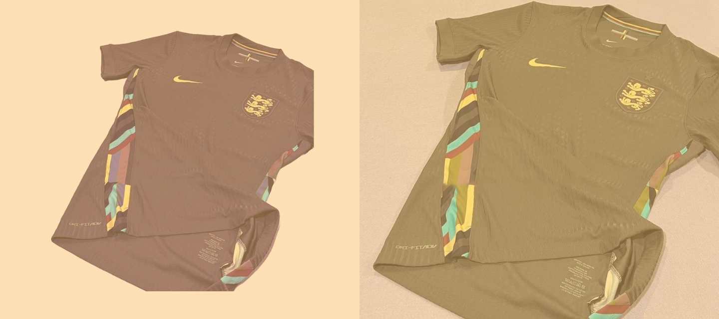
If you'd have polled 100 England fans asking them to guess what the colour of the next away shirt would be, I'd be surprised if anyone would have guessed purple.
by Phil Delves December 11, 2023 3 min read
by Phil Delves November 23, 2023 4 min read
by Phil Delves November 06, 2023 4 min read