

A collection of all Football Shirt Collective blogs, including Collectors Club advice, interviews and things we like.
At the Football Shirt Collective our aim is to be the most trust football shirt seller in the market. That is why we started producing 'Collectors Club' content. Tips for football shirt collectors on how to wash your kits, store your kits and even spot a fake.
Read our articles below and if you have any questions you want to ask do not heesitate to get in touch.


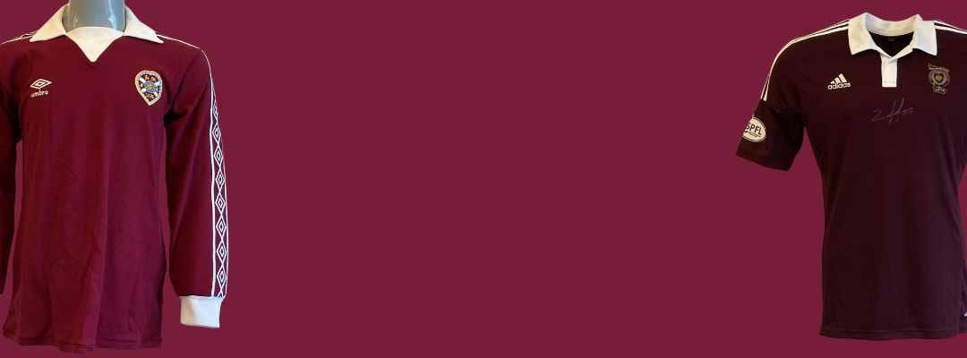
From Tynecastle legends to rare cult kits, take a nostalgic look at the most beloved vintage Hearts shirts of all time—curated by a true Jambos collector.

Remember going to your favourite sports shop as a kid? Hearts shirt collector, Chris Simm, talk us through his first and favourite kits.