

Of all the kit design competitions we've seen over recent years, the recent Marshall Islands competition might be the most interesting.
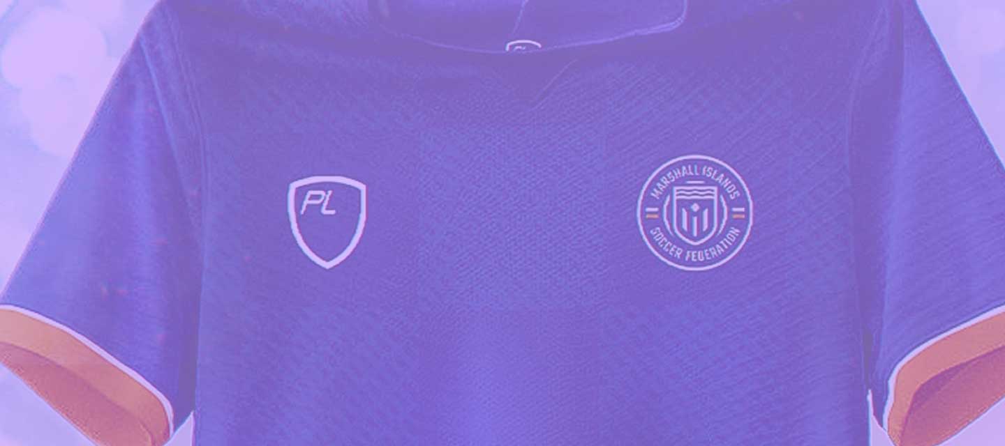
The tiny Pacific country are "the last nation on earth without a football team", and as part of a new campaign which has already seen a new crest and the beginnings of a new stadium development the country are looking for their very first football kit.
Unsurprisingly the open competition drew a lot of interest, so much so that I wanted to highlight 3 of my favourites from the many entries we saw. Full disclaimer before we continue, I did not include my own design in this list!
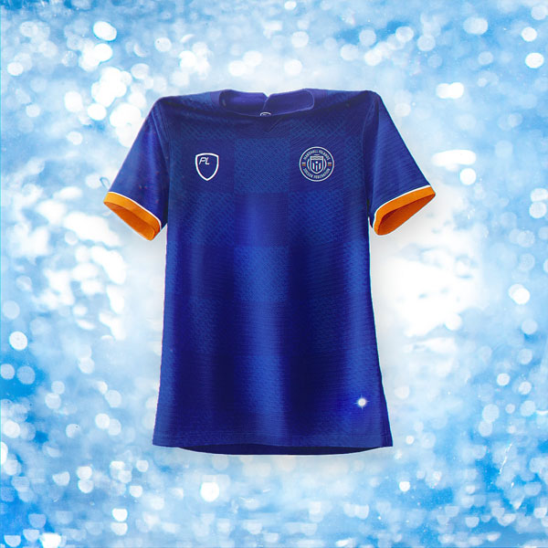

Kicking off my top 3 is this understated look from @pa_perennou. International kits are often more reserved in nature, but this design takes that typical look and packs it full of pleasing details which you can enjoy up close. A subtle large checkerboard acts as a strong base, with the brand mark and crest sitting neatly within two of the squares. My favourite detail is the subtle line pattern seen across the body of the shirt. The look is inspired by navigational stick charts used by the Marshallese, and of the selection of shirts which drew on this idea this was my favourite execution. A flash of orange on the cuffs and a 24-point star as a jock tag detail were more positive elements.
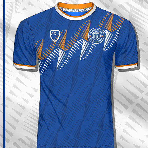
Another design which I really liked came from @yournameyourno. Their shirt took the orange and white stripes of the flag and displayed them in an attractive waveform-like pattern. The underlying pattern is what draws me in here, it has a nice level of contrast which adds interest to the kit as a whole whilst also packing a punch when highlighted in orange/white. Like the previous creation this feels realistic for an international kit; a factor in each of my choices.
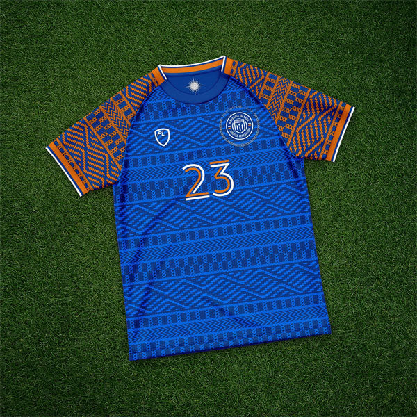

Rounding off my list is the boldest look of the 3 from @MattTams. Matt drew inspiration from Marshallese dress mats, and he's channelled the aesthetic brilliantly with an all-over pattern full of intricate shapes. As you zoom in closer the sharpness of the pattern shapes only enhances things. Full marks for adding commemorative details around the crest, too.
I'd encourage you to check out all the entries that The Marshall Islands federation received on Twitter, as there is a lot to enjoy. From hand drawn sketches to HD creations from the biggest names in the community, I can't remember an open competition this competitive. At the end of the day the winner will be The Marshall Islands and brand PlayerLayer who have recently been announced as the manufacturers of the inaugural shirt.
As soon as we get more on the competition we'll be sure to bring you the news.