by Phil Delves September 23, 2023 1 min read
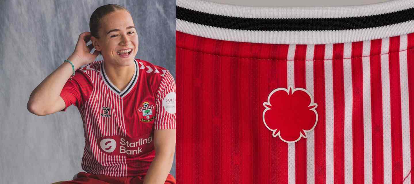
Who spotted the easter egg in the Southampton FC football shirts made by hummel this year.
The same rose on the crest is utilised both as a back neck detail and within the pinstripes of the main design; a smart incorporation.

Moving to the away, we travel higher up the crest and get a white and teal design which focuses on the wave pattern. Once again a back neck detail is complemented with a more subliminal element, this time in the form of a repeating wave pattern in the body. Though the shade of teal is not a match to the light blue of the waves on the crest, I'd argue this was a positive move given the end product.

The recently announced third shirt has us moving up once again on the crest, this time channelling the energy of the focal point of the crest, the clip art tree which represents the New Forest. A forestscape runs across the shirt in black and grey tones, and you should have expected by this point the tree is featured as a well-executed back neck detail.

When viewed in isolation each of these shirts are more than solid, but the fact that they are all joined together by the crest they all feature elevates proceedings. This is a collection as smart as they come; not in the sense that it is trying too hard to be clever but rather that it is rewarding those who can take time to appreciate what is going on.
Check out our collections of vintage and modern Southampton FC shirts here

As Head of Content, Phil is the creative playmaker of the team, covering every angle of football shirt news in our blogs and weekly Newsletter. Whether it's telling your fakes from your authentics, or deep dives into the newest football shirts designs, Phil will have all your football shirt content needs covered.
Sign up to get the latest on sales, new releases and more …