Recently added
Vintage shirts
Concept kits
Legends
Ranking all the big 2021 kit leaks
by Phil Delves February 25, 2022 6 min read

2021 kit leaks are everywhere. With releases just around the corner we’ve now seen supposed leaks for pretty much every major team, and if you’re anything like me you’ll already be keeping some sort of mental lists of which kits to look out for, and which ones to avoid.
As always these 2021 kit leaks are subject to major changes, but given how close we are to the actual releases we’re getting a decent enough idea of what we can expect.
Though I’m perhaps jumping the gun a little bit, I thought it’d be fun to do a quick ranking for a selection of leaks as we look ahead to the official launches. Once again, please take everything you see here with a pinch of salt, as I won’t be commenting on the accuracy of said leaks, but hopefully there’ll be something here to get you excited (or more likely, fill you with dread).
#1 - 2021 Ajax third shirt leak

All aboard the hype train; Ajax’s rumoured Bob Marley shirt is without a doubt the most popular leak we’ve seen so far for next season, and I’m bought in.
Though the most recent predictions aren’t quite exciting as some earlier suggestions, I’m still excited to see the kit for real. The Ajax - Bob Marley connection is unusual (the Marley song “Three Little Birds" was adopted by fans as a club anthem), but it’s exactly these sorts of stories which make a football shirt so much more.
It’s also refreshing to see a design that is likely to lean more towards more subtle details rather than something like a crazy pattern. As much as I've enjoyed the pattern-led landscape of the past couple of years, I'm now ready for a couple of years of designs which major more on subtle details.
#2 - 2021 PSG home shirt leak

I was sceptical about PSG’s rumoured use of the Jordan logo for their upcoming home kit, but after seeing the latest leaks I’m beginning to move from scepticism to excitement.
Though the complete lack of red in the body of the shirt is a big departure, the collar and cuff detailing, which mirrors the look of the Chicago Bulls jerseys of the Michael Jordan era, is a masterful touch which is perhaps the best example yet of Jordan blending the worlds of basketball and football.
Many people will understandably struggle to get over the lack of red (although previous PSG home shirts in 2012, 2014 etc. weren’t much redder), but if you’re able to look past that you can join me in anticipation.
#3 - 2021 Barcelona home shirt leak

In what I assume will be my most controversial opinion on this list, Barcelona’s crazy new home shirt is one of the designs I’m most looking forward to seeing on the pitch in 2021.
Frankly, there is a lot to take in here. In a dizzying mashup of patterns, the traditional stripes of Barca have been transformed into a look broadly similar to the design of the club crest.
After the checked home kit of 2019 and the hooped look of 2015, this will be the final nail in the coffin for many fans. Though I know I shouldn’t like it, I find myself drawn to the design even though I’ve been a vocal critic of mash-up kits in recent years.
#4 - 2021 Real Madrid home shirt leak

It’s been a long time since I’ve rated a Real Madrid home shirt highly, but 2021 might be a turning of the corner. In a look which reminds me somewhat of the 2013/14 home shirt, the pure white of Real is complemented with orange and blue accents.
Real have experimented with all sorts of secondary colours on their home kits over the years, including pink, gold and teal, but this orange and blue combo intrigues me. Better than the colours is the swirling subliminal pattern which, depending on the final look, has the potential to elevate the already decent design in my book.
#5 - 2021 Dortmund home shirt leak

Dortmund are embracing the bumblebee aesthetic with their upcoming home shirt, and I’m a fan.
The shirt isn’t spectacular, but it’s an upgrade on this season’s home shirt. Many of the best Dortmund shirts of the 90s focused much of their efforts on the sleeves, and as such this shirt reminds me of that legendary period. This isn’t a shirt that reaches the heights of the 90s, but I like what I see from Puma.
#6 - 2021 Arsenal home shirt leak

Arsenal are ‘doing an Ajax’ next season, and if you’re going to imitate another club you could do a lot worse.
It’s not the first time Arsenal have had a shirt in this sort of style, and the 1998 home shirt from Nike is the most natural comparison. It’s amusing to see adidas bringing back a look from their rival’s back catalogue, but the end result has every chance of looking good.
#7 - 2021 Juventus home shirt leak

Rejoice, Juve fans!
After a few seasons of home shirts on the more experimental end of the spectrum, including the painterly stripes of the 2020 home and the infamous half and half of 2019, adidas are returning to the classic striped aesthetic.
It should’ve been a slam dunk, but the addition of the “4xe” sub sponsor (which made a select number of appearances last season) is an eye sore which is hard to ignore. There’s a real 00s sci-fi game look to the logo, which clashes in every sense of the word with the rest of the relatively sleek Juve shirt. In many ways the sponsor is flying the ‘Chevrolet at United’ flag, just as Chevvy have walked out the door.
#8 - 2021 Manchester United away shirt leak

Speaking of Manchester United, their upcoming away shirt is likely to appeal to a broad audience. Like many other kits over recent years, the design harks back to a classic look from the past, in this case one of United’s best ever shirts; the 1990 ‘snowflake’ shirt.
This reminds me very much of the story of Arsenal’s 2019 away, which put a modern twist on the famous bruised banana. Like Arsenal's kit, the United reinterpretation inevitably falls a little bit flat in comparison to the 90s version, but in the same breath adidas deserve credit for not simply trying to remake the old kit.
#9 - 2021 Liverpool home shirt leak

Nike played things relatively safe in year 1 of their Liverpool deal (as is typical with new kit deals), and I was fully expecting something a bit more 'out there' in year 2.
Though the 2021 home kit is set to be somewhat different, this feels like a shirt that wanted to go much further. The diagonal lightning-bolt pinstripes feel more ‘Nike’ than ‘Liverpool’, and the bright red/coral/pink secondary colour (which reminds me of the secondary colour of the 2020 third kit) is an unusual choice. I like the look of Nike's new player issue texture, but that's completely independent of the shirt design.
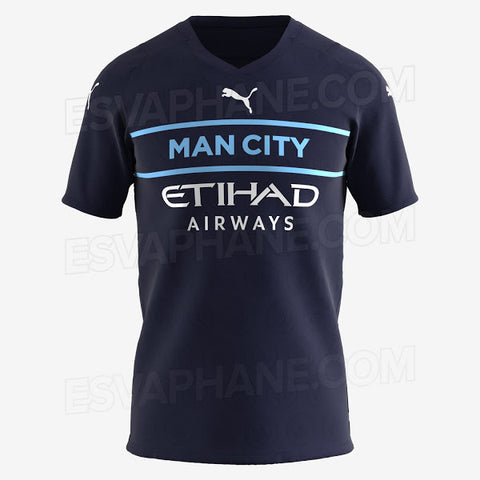
#10 - 2021 Man City third shirt leak

Puma’s third kits are going to be tough to stomach next season.
You’ve seen the leaks, and you’re probably worried. Though I’ve highlighted Manchester City here, I could have picked out a number of other Puma teams who are set to adopt the same sort of radical, crest-less approach of Puma’s international away shirts.
Crests haven’t always been on football shirts (see Bayern Munich in the 80s), but it’s nonetheless a big step for Puma to ‘relegate’ the crest to a subliminal pattern on the body of the shirt. Though some of the typefaces on the middle of the 3rd kits are set to be interesting, others like what we’re likely to see from City look decidedly bland.
I’m not as low on these designs are others (which is rich to say, given how low this on the rankings), but I still can’t get too excited based on what we’ve seen.
#11 - 2021 Chelsea home shirt leak

Rounding off this list is City’s opponents in the Champions League final, Chelsea.
Chelsea’s home shirts from Nike have got better and better each season, until now. The 2021 home shirt feels like a desperate attempt to jump on the post-Nigeria bandwagon, and though I’m usually quite high on Nike I can’t defend this one.
I quite like the shocking yellow colour used for the swoosh and side detailing, but the pattern is a disaster here. In a mashup of zig-zags and checks, the finished look is caught between different ideas without nailing one approach.
Which 2021 kit leaks are you most excited to see for real? Leave a comment and let us know!
Phil Delves
As Head of Content, Phil is the creative playmaker of the team, covering every angle of football shirt news in our blogs and weekly Newsletter. Whether it's telling your fakes from your authentics, or deep dives into the newest football shirts designs, Phil will have all your football shirt content needs covered.
Leave a comment
All teams
- Premier League football shirts
-
Other English clubs
- Birmingham City
- Blackburn Rovers
- Charlton Athletic
- Coventry City
- Derby County
- Hull City
- Ipswich Town
- Leicester City
- Middlesbrough
- Millwall
- Norwich City
- Portsmouth
- Preston North End
- Queens Park Rangers
- Sheffield United
- Sheffield Wednesday
- Southampton
- Stoke City
- Swansea City
- Watford
- West Bromwich Albion
- Scottish clubs
- Italian club shirts
- Spanish club shirts
- German club shirts
- International
- French club shirts
- Rest of the world
-
Legends
- Adriano
- Alessandro Del Piero
- Andrey Arshavin
- Alvaro Recoba
- Bobby Moore
- Bryan Robson
- Bukayo Saka
- Clarence Seedorf
- Cristian Vieri
- Cristiano Ronaldo
- David Beckham
- David James
- David Seaman
- David Ginola
- Dennis Wise
- Dennis Bergkamp
- Didier Drogba
- Dimitar Berbatov
- Diego Maradona
- Edgar Davids
- Eric Cantona
- Fernando Torres
- Freddie Ljungberg
- Gabriel Batistuta
- Gianluca Vialli
- Gianluigi Buffon
- Giovanni Elber
- Frank Lampard
- Francecso Totti
- Haaland
- Harry Kane
- Hidetoshi Nakata
- Ian Wright
- Jari Litmanen
- Ji Sung Park
- Juninho
- Jurgen Klinsmann
- Kaka
- Landon Donovan
- Lionel Messi
- Lothar Mattaus
- Luis Figo
- Mark Viduka
- Matt Le Tissier
- Mesut Özil
- Michael Owen
- Mikel Arteta
- Neymar
- Nicolas Anelka
- Nwankwo Kanu
- Paolo Di Canio
- Paolo Maldini
- Patrick Vieira
- Rafael Van der Vaart
- Raul
- Riquelme
- Rivaldo
- Robert Pires
- Roberto Baggio
- Robbie Fowler
- Ronaldo Nazario
- Ronaldinho
- Roy Keane
- Rudi Voller
- Ruud Gullit
- Ryan Giggs
- Santi Carzola
- Steve Bull
- Steven Gerrard
- Teddy Sheringham
- Thierry Henry
- Tony Adams
- Toto Schillaci
- Tugay
- Wayne Rooney
- Xabi Alonso
- Zinedine Zidane
- Zola
- Brands
Subscribe
Sign up to get the latest on sales, new releases and more …


