Recently added
Vintage shirts
Concept kits
Legends
The 1994-95 Premier League shirts rated
by Phil Delves February 05, 2022 10 min read

Rating every 1994 Premier League shirt
Last time round we took a look at the shirts which graced the inaugural year of the Premier League. Arsenal and Norwich dazzled and amazed, whilst Crystal Palace were left on the outside looking in.
I’m going to jump forward a couple of seasons now to look and see how a fresh crop of teams fared on the kit front, reviewing all the 1994 premier league shirts as if I was doing so at the time.
How will the appearance of Nike shake things up, if at all? Will new boys Leicester be able to make an audacious, 2016/17-esque claim for top spot? Let’s have a gander, with the help of some typically gorgeous illustrations from the legends From 12 Yards.
1994 Arsenal home shirt


Nike have entered the Premier League with Arsenal of all teams; a team who have enjoyed consistently fantastic shirts from former supplier adidas. But despite this most audacious entrance, they’ve managed to pull it off and some.
As you’d expect there are a number of big changes for both home and away. A subliminal lightning bolt pattern is seen on both kits, and it’s a design which adds depth and interest whilst managing to retain a sense of class. It’s worth highlighting the colours of the away too. You’d have to go all the way back to the 60s to find the last time The Gunners wore blue as an away colour, but this very traditional colour choice in combination with a very modern design is a fresh and very welcome take.
Grade: A
Aston Villa


Sometimes a sponsor elevates a shirt, and in the case of Aston Villa their already strong home and away kits are elevated by the highly memorable logo of yoghurt kings Müller. These kits have been carried over from last season, but as I’ve said before that’s never a bad thing if those designs are good in their own right.
Shoutout to the away for it’s daring green and black stripes (with red trim). Away kits across the league are largely getting bolder this season and it’s an absolute treat for someone like myself
Grade: B+
Blackburn Rovers
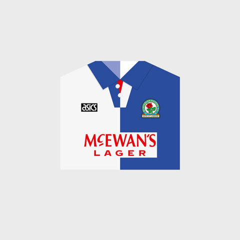

Some clubs favour evolution over revolution, and Blackburn are very much in the former camp. That shouldn’t be seen as a negative though, as the tweaks Rovers have made are worthwhile.
The shadow pattern seen on the home kit of the past two years has been removed in favour of a cleaner base, whilst there are also changes to the collar. Don’t miss the introduction of some script, with the famous club motto “Arte et Labore” across the middle of both arms, a creative decision which is rarely seen across shirts.
On the away side the red and black colour scheme has been retained, but the classic AC Milan-esque stripes have been replaced with a pinstripe look.
Grade: B
Chelsea


Talk about a tale of two halves. Chelsea’s home shirt sees only one notable change from 1993/94 in the form of a new sponsor, with Coors following on from the popular Amiga sponsor before it.
But then the floodgates open!
I don’t know where to begin with this away shirt. Probably the most significant feature is the somewhat reckless levels of orange, but that’s only the start. The main body and grey section looks a bit like a tribute to USA’s current denim away shirt, and then a criss-cross pattern and stripes dominate the top area of the shirt. This is a lot to take in, though even though it’s not the most aesthetically pleasing kit, Umbro and Chelsea are at least trying their best to push the envelope.
Grade: B-
Coventry City


Goodnight sweet prince.
For all it’s faults, the Coventry shirt of the past two years was one of the more exciting designs in football. Pony have replaced Ribero for the 94/95 Premier League season, and they’ve brought with them a clean, understated design with a much less in-your-face subliminal pattern. It’s hardly a big downgrade, but I can’t help but feel a little sad to see the old design phased out.
On the away side, we have a crowd pleasing green and black striped design. It’s very smart of a new manufacturer to start things off with a traditional colour combo, and the relatively unusual palette is virtually unique in the league (unless you count Liverpool’s away, which has far more white in comparison).
Crystal Palace


Palace kits are now designed by relative new boys Nutmeg, and they are bringing a conservative set of looks to the table. There are the smallest of changes to the collar, but otherwise this looks like a brand who either had too little time or were simply too scared to deviate from the norm.
Even the away kit, which features a pleasing pattern on a yellow base, is very similar to the away kit of recent seasons. In life standing still is often worse than moving forward, and that certainly applies here.
Sorry Palace fans.
Grade: C-
Everton


Ok Everton, you’ve got my attention.
The Toffees home shirt is retained from last season, but it’s the away that has caught my eye. I enjoyed the salmon infused look of the past two years, but this new effort from Umbro is a decent change of pace.
A series of patterned sections frame the middle of the kit, and even though there are similarities in some of the patterns to the slightly confusing Chelsea away shirt, the more palatable colour scheme here keeps things from veering too far off course.
Grade: B
Ipswich Town
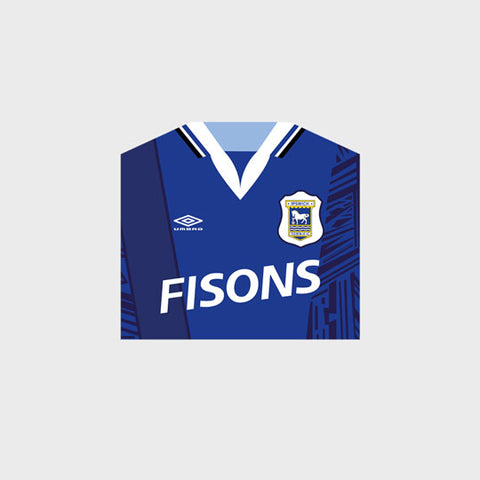

The pattern of the new Ipswich Town home shirt bears resemblance to Everton’s away shirt mentioned above and like that kit, this is a good example of how a potentially chaotic design can be tempered by a considered choice of colours. This is unmistakably an Ipswich kit, and if anything I’m glad we’ve got a little less white on the kit compared to last season.
For the away kit, we have a slightly underwhelming design. The stripe outline effect just feels half baked to me, though at the same time it’s not offending me enough for there to be a significant points reduction.
Grade: B-
Leeds United
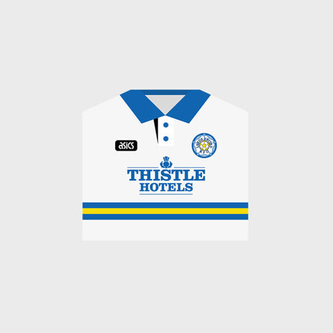

There was absolutely nothing wrong with Leeds’ kits last year, so whilst I would usually advocate for significant changes and development, I’m going to make an exception here.
Seriously, the very continental central stripe (a sort of thin, Sampdoria look if you like) on the home is one of my favourite looks across the league. This tidy home kit is complemented by a traditional, striking blue and yellow striped away kit. It’s a near perfect tandem which proves that Asics can kick it with the best of them.
Grade: A+
Leicester City


I’m liking what I see from Fox Leisure.
After two years of an all blue home kit, this season sees the addition of white and yellow details. It sounds simple, but the execution is superb. Things are even better for the away shirt, which is a dominant, yellow/mustard shade. This is complementary shirt work at it’s finest, and though I’m partial to a good pattern I get just as excited about great colour choices.
Grade: B+
Liverpool


Liverpool are taking a page out of Leeds’ book and sticking with a set of kits which rival anything you’ll see at the moment.
There is precious little adidas representation in the Premier League, but Liverpool are flying their flag high with a geometric design which celebrates the three stripes of adidas. The away kit in particular has really grown on me since it’s release, and something about the black stripes seems to just make sense, especially when you consider the look of the adidas logo itself.
If it ain’t broke, don’t fix it.
Grade: A
Manchester City


I’ve been quite positive of teams that have kept a kit that worked well last season, and the theme continues with City’s tidy home shirt from Umbro which I’m glad to see return for a second term.
The away however is harder to stomach. Much like Chelsea, we have a pattern here which is different but equally difficult to look at. City’s traditional colours of red and black are here, but in all honesty I much preferred the purple efforts of recent seasons.
Grade: C
Manchester United


The future is here.
Don’t get me wrong, the new Manchester United home shirt isn’t going to completely revolutionise the kit world in one fell swoop. However, the use of subtle photo of the stadium is a superb and unusual direction which, for my money, completely works. I’d love to see more shirts try this sort of design, and that is about as high a compliment as I can give.
Given the relatively radical home shirt, it makes sense to keep the black away kit which was already doing quite well for itself last year. No complaints from me.
Grade: B+
Newcastle United


Newcastle are almost always good value for shirts, and the 1994 home and away kits (which have been carried over from last season) are jewels in a competitive Premier League crown.
The central star of the home shirt catches the eye for all the right reasons, and the away is a perfect partner in crime. It almost looks as if dreamy blue base of the shirt has been cut out from the home shirt star itself.
I actually don’t know how you’ll top that star in the middle of the home kit. I don’t think it’s possible.
Grade: A+
Norwich City

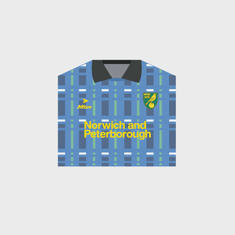
In the case of Norwich City here, we have a classic example of a team whose shirts will forever be in the shadow of a memorable kit of the past. Whether you loved it or loathed, the “bird poo” shirt married an eccentric design with a selection of iconic results. The new home shirt is one of the better efforts this year, but it’s not jumping out as much as it should because of previous years.
Unfortunately, all the good work of the home shirt is somewhat undone by a bizarre away shirt which looks like a rejected Scotland design. Whether the pattern is technically tartan or not is a question I’ll let someone else answer, but all I know is this doesn’t do anything for me.
Grade: C+
Nottingham Forest


I’ve been quite critical of the Umbro template seen on Chelsea and City’s away kit, but for Nottingham Forest’s new home kit the design looks a lot more, well, at home.
There’s quite a lot of black on this kit in comparison to Forest kits over the years, but it largely hits the mark for me. The away kit is a pleasing two-tone blue look (with similar colours to Arsenal’s away), with a good use of shadow stripes being the particular highlight.
Grade: B-
QPR


There isn’t too much to say about QPR’s new kits. On the home shirt, the crest and manufacturer logos are back inside a blue hoop (which for some reason I prefer as opposed to when the details were in a white hoop like last year), and we now have a tidier, wrap over collar.
A relatively simple red away shirt is also a slight improvement on the black effort last season, but I just can’t get excited by these kits.
Grade: C+
Sheffield Wednesday


Puma have a relatively small footprint on English football at the moment, but on the evidence of Sheffield Wednesday’s kits I’d like to see more of their work in the coming years.
Both home and away kits for Wednesday are well crafted. You know what you’re getting on the home side, but the width of the stripes looks just about perfect to me especially with all the details in place. The away kit then acts as the more exuberant brother to the home, with a yellow and purple pinstripe design that exhibits the same good attention to detail of the home.
Grade: B
Southampton


Southampton’s kits are very ‘Rugby League’, but whilst the central “V” that forms is somewhat unusual, Pony deserve credit for trying something new. I saw new, the home and away have both been brought forward from last year, and there is also a similar approach to be found over at West Ham, but since its release this design have grown on me. It’s not to my personal taste but it’s a talking point.
It’s worth mentioning that this is a rare example of a shared design across home and away too, an art which is becoming increasingly rare in football.
Grade: B-
Tottenham Hotspur


Since the arrival of Umbro to White Hart Lane, Spurs fans haven’t been messed about at all in regards to the home kit. The pleasing home design of last year has carried over for a second year, as the first Umbro kit was between 1991-1993, so no one can accuse Umbro of upsetting the apple cart.
There is a new kit however on the away side, and it boasts a pretty tasty navy and purple colour scheme. It’s a nice change from the recent yellow kits, and the relatively subtle nature of the purple pattern is a look which Umbro are really good at creating.
Grade: B
West Ham United


As we mentioned before, West Ham boast a design similar to that of Southampton. However, the stripes seen on Southampton’s shirt have been removed for The Hammers, leaving the rest of the kit with a little more room to breath. I like the change, and my positivity only grows when looking at the away kit too.
We have a similar effect to the Leeds home here, with a couple of thin central lines which work well with the sponsor. This is definitely one of those under the radar designs which deserve to be commended, and it’s an aesthetic which is very much to my taste.
Grade: B+
Wimbledon


Wrapping up the list once again are Wimbledon. The team’s kits are the sort of thing you’d expect from shirts that are designed in house, but whilst there is nothing to truly capture the imagination we also have a set of kits here that are very much fit for purpose without any real clangers of a decision.
Something about the white and black away in particular really works for me. Monochrome kits are quite a rare sight, with Newcastle’s home being the closest thing were it not for the sponsor, and for that I have to give a few marks.
Grade: B
The shirt illustrations are pretty cool, huh? Did you know you can get a bespoke print from the same people behind the shirts, featuring 3 kits of your choosing.
Check out our store for details.
Phil Delves
As Head of Content, Phil is the creative playmaker of the team, covering every angle of football shirt news in our blogs and weekly Newsletter. Whether it's telling your fakes from your authentics, or deep dives into the newest football shirts designs, Phil will have all your football shirt content needs covered.
Leave a comment
All teams
- Premier League football shirts
-
Other English clubs
- Birmingham City
- Blackburn Rovers
- Charlton Athletic
- Coventry City
- Derby County
- Hull City
- Ipswich Town
- Leicester City
- Middlesbrough
- Millwall
- Norwich City
- Portsmouth
- Preston North End
- Queens Park Rangers
- Sheffield United
- Sheffield Wednesday
- Southampton
- Stoke City
- Swansea City
- Watford
- West Bromwich Albion
- Scottish clubs
- Italian club shirts
- Spanish club shirts
- German club shirts
- International
- French club shirts
- Rest of the world
-
Legends
- Adriano
- Alessandro Del Piero
- Andrey Arshavin
- Alvaro Recoba
- Bobby Moore
- Bryan Robson
- Bukayo Saka
- Clarence Seedorf
- Cristian Vieri
- Cristiano Ronaldo
- David Beckham
- David James
- David Seaman
- David Ginola
- Dennis Wise
- Dennis Bergkamp
- Didier Drogba
- Dimitar Berbatov
- Diego Maradona
- Edgar Davids
- Eric Cantona
- Fernando Torres
- Freddie Ljungberg
- Gabriel Batistuta
- Gianluca Vialli
- Gianluigi Buffon
- Giovanni Elber
- Frank Lampard
- Francecso Totti
- Haaland
- Harry Kane
- Hidetoshi Nakata
- Ian Wright
- Jari Litmanen
- Ji Sung Park
- Juninho
- Jurgen Klinsmann
- Kaka
- Landon Donovan
- Lionel Messi
- Lothar Mattaus
- Luis Figo
- Mark Viduka
- Matt Le Tissier
- Mesut Özil
- Michael Owen
- Mikel Arteta
- Neymar
- Nicolas Anelka
- Nwankwo Kanu
- Paolo Di Canio
- Paolo Maldini
- Patrick Vieira
- Rafael Van der Vaart
- Raul
- Riquelme
- Rivaldo
- Robert Pires
- Roberto Baggio
- Robbie Fowler
- Ronaldo Nazario
- Ronaldinho
- Roy Keane
- Rudi Voller
- Ruud Gullit
- Ryan Giggs
- Santi Carzola
- Steve Bull
- Steven Gerrard
- Teddy Sheringham
- Thierry Henry
- Tony Adams
- Toto Schillaci
- Tugay
- Wayne Rooney
- Xabi Alonso
- Zinedine Zidane
- Zola
- Brands
Subscribe
Sign up to get the latest on sales, new releases and more …


