


In a few short hours the 2024 MLS season will kick off. For all the frustrations surrounding the price of MLS kits, not to mention the egregious disparity between replica and player spec shirts, the designs themselves have proven to be a hit amongst collectors in recent years. This season is shaping up to be no different, with a good range of looks and something to suit most tastes.
I've picked out a few personal favourites for your enjoyment.
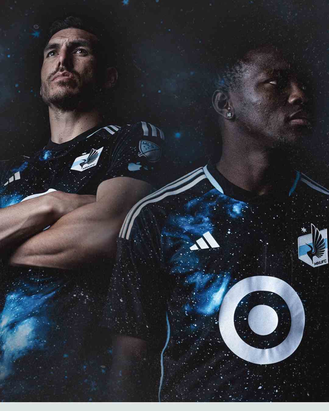
Let's start with perhaps the most dazzling of the class of 2024. Minnesota United have been one of the better teams in MLS when it comes to kit design since their ascension to the league in 2017 (can you even "ascend" in a league structure without promotion/relegation?). Their 2024/25 home carries on that tradition and some with an all-over galaxy pattern on a black base. Helping to cement the look are the colours seen in the galaxy itself, with various blue tones producing a pleasing aesthetic whilst also tying into the club colours.
Though a plain back interrupts the pattern party (this is a league-wide problem, unfortunately) it's good to see the extension of the stars across the sleeves. Embossed details on the hem of the shirt are another nice touch. Other than the plain back, my main disappointment with the shirt is that, at least from the release pictures I've seen, there aren't any tasty details in the form of a jock tag or back neck detail. MLS teams are typically very strong in the area, and a well placed design element could have elevated this one to even greater heights. Regardless it remains a highlight.

Though not nearly as eye-catching, I want to also mention the San Jose Earthquakes away. At first glance this is a plain white shirt with red details; hardly a design worth our time. On closer inspection however there are some really strong touches, and it starts with the embossed details. In the red panels at the side of the shirt are a series of shapes including retro elements from the teams past such as old crests. As I've mentioned many times before in Collectors Club I'm a huge fan of embossed details such as these, as it's the kind of thing which could easily be missed.
The other star of the show is the retro crest. This could easily be marked as "nostalgia bait", a lazy, shameless attempt to cash in on the enduring popularity of the retro aesthetic, but in a world of overly-corporate logos for crests an old-school look such as the one San Jose have resurrected is a breath of fresh air. It's a shame we can't return to the days when crests such as these were splashed across the chest of a shirt in as big a size as possible, but I'll take the small scale look we ended up with.
Here are two more MLS kits for your consideration.

The first is a gorgeous take on the anniversary theme. Many anniversary kits run down the oft-trodden black and gold road, but Vancouver Whitecaps have taken the daring decision to go navy and gold. I know, it's hardly a big departure, but the simple point of difference is enough to make me take a closer look. And indeed, once you look more closely you'll be able to enjoy the embroidered jock tag detail and the crest which, like the San Jose crest mentioned previously, is a look unearthed from the past. The flashes of white on the neckline and back panels of the kit complete the look (as do the white socks).
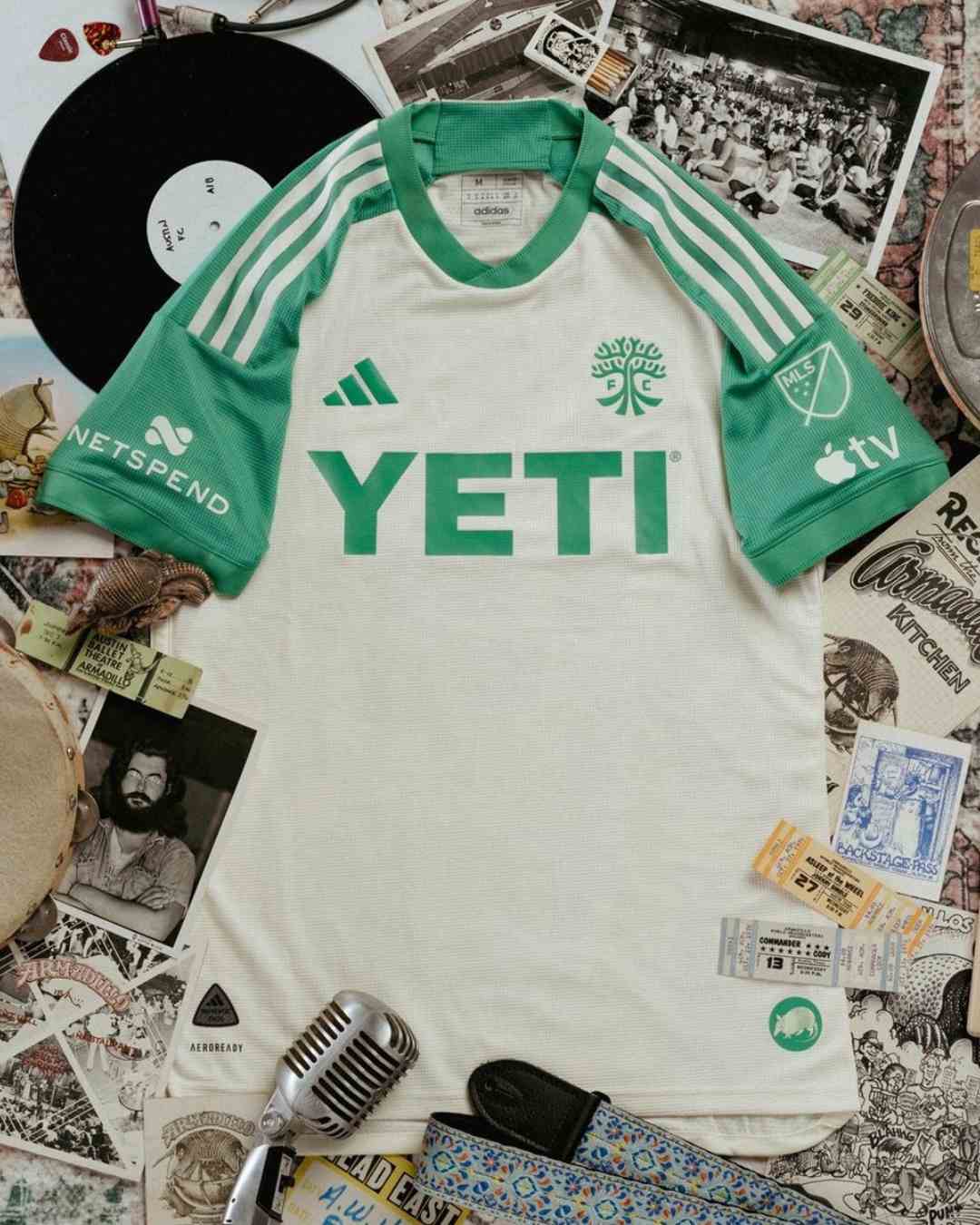
Last year I really enjoyed Austin FC's stripey take on dazzle camo, and this year I'm enjoying their handiwork on the other end of the spectrum. Their new away is a subtle cream and soft green affair which pays tribute to an old music venue called the "Armadillo" which was active in the 70s. A jock tag detail (of an armadillo, naturally) and back neck detail (with the address of the venue) help tell the story, but it's the alternate crest featuring just the tree and "FC" of the Austin crest which is my favourite touch. Alternate crests can add a lot to a shirt, and this immediately goes down as one of my favourite badges across MLS.
Ultimately it's the colour combo which gives this shirt a place in my list. When you use just two colours on a kit you have to get your choices spot on, but that's exactly what adidas and Austin FC have done here. Cream is very much in, but it's rarely been paired with such an attractive shade of green. It has a sort of faded, aged look which gives the kit something of a timeless feel. As soon as this hits the sales rack, I'm in.
Browse our collection of MLS football shirts here.