

For the best part of 20 years, Nike and adidas have been in a tier of their own in the football shirt game.
Many worthy challengers such as Puma and Umbro have risen on occasion, but the Swoosh and Three Stripes have been the most consistent brands from a market share and brand visibility perspective.
Just like any good rivalry each side has at different points forced the other to raise their game. adidas in particular seem to be responding well to Nike's strong run from 2018 onwards, as evidenced by the new collection of kits for the Women's World Cup. But for today's Collectors Club I want to break down what Nike have brought to the table in response.

One word dominated the conversation in the wake of Nike's huge drop on Monday: boring. For many people this was Nike up to their old tricks, rolling out virtually identical shirts for multiple teams in the vein of tournaments like Euro 2016. A smattering of more patterned designs wasn't enough to stem popular opinion.


Though there are admittedly quite a few forgettable 'filler' shirts, we need to look at this more closely and consider the context. For starters, Nike's choice to unveil all their new home and away shirts was a notably different take to adidas, who chose to only reveal away shirts for their teams. With away designs typically being more daring than home ones (especially the new adidas kits), Nike were always playing on the backfoot somewhat.

I'd also argue that plain shirts are not necessarily a problem. Long-time readers will know that I've been calling on brands to help move us on from the pattern heavy 'post-Nigeria' world we find ourselves in. Don't get me wrong, I love what adidas did a couple of weeks ago, but the arms race to find more and more dazzling patterns has to stop at some point. We need more innovations from a technology perspective in my books.
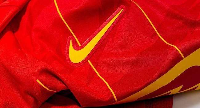
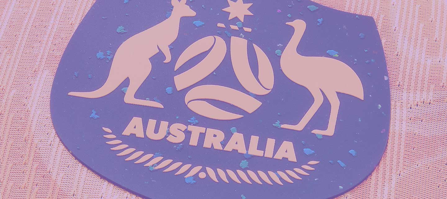
Now, Nike did bring some innovation from a tech perspective, but it's largely imperceptible at first glance. The introduction of "Nike Leak Protection: Period", new tech developed with pro players, is a positive one, but it won't show up on any release pictures. Also hidden at first was the use of Nike Grind, materials composed of post-industrial manufacturing scrap.


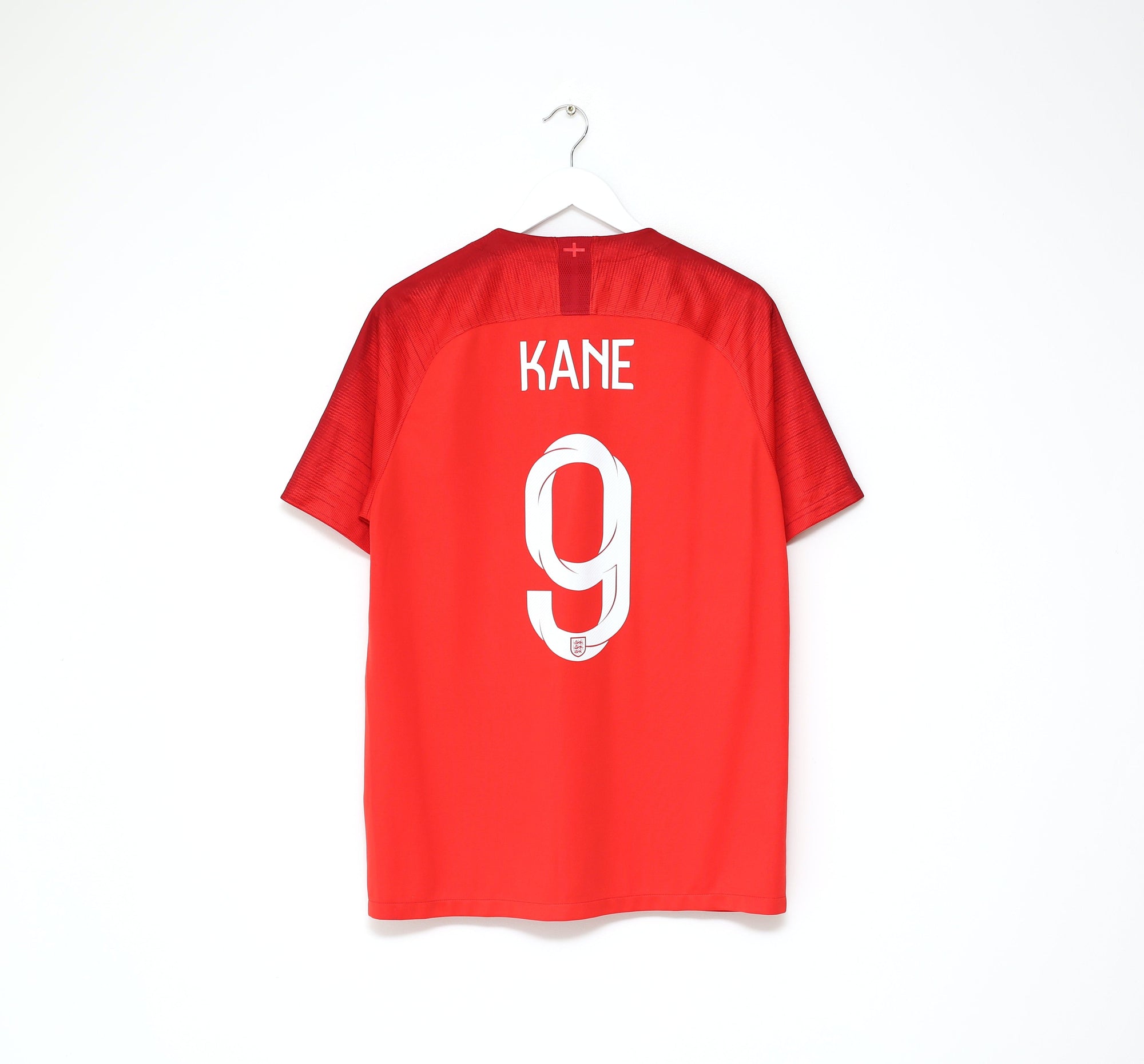
This is the first time Nike Grind has been used on Nike football shirts (it's been used in various ways for a number of years now), and it looks absolutely stunning. Zoom in on any of the new crests and you'll see what I mean. The flecks of colour look especially good on Australia and the Netherland's crests, but the subtlety of the England crest for example is perhaps even better for the way it adds depth and interesting without distracting at all.
This is also a good collection of shirts from a colour perspective. Sure, there are only a handful of patterns on the body of the shirts, but the colourway of the Australia away shirt or the secondary colours on the New Zealand and South Korea away shirts are lovely design decisions. Though nothing too huge, recoloured crests on shirts like USA away and Netherlands away also showcase some attention to detail.


I'd go as far to say that there are some shirts I'd take here over any of the adidas shirts. As a collective, the adidas kits are stronger given the amount of Nike shirts which quite frankly offer nothing of note (Portugal home, both kits for Norway and China etc.), but the highs for Nike are very high here.
We need to move on from the narrative that a plain shirt is a bad one. Patterns are fun, but they aren't always needed. Good colour choices and considered improvements in areas like materials and technology go a long way, even if they're hard to notice at first glance.