

If you'd have told me on Monday that we were getting a new set of names and numbers for the Premier League during the week I would've been hyped. The most recent changes in 2017 were largely quite disappointing to me, both from a design perspective and due to the strict limitations on colour options. Any sort of reset would have been a welcome one.
It just so happens that we did get an overhaul, but I am left completely underwhelmed by the results.


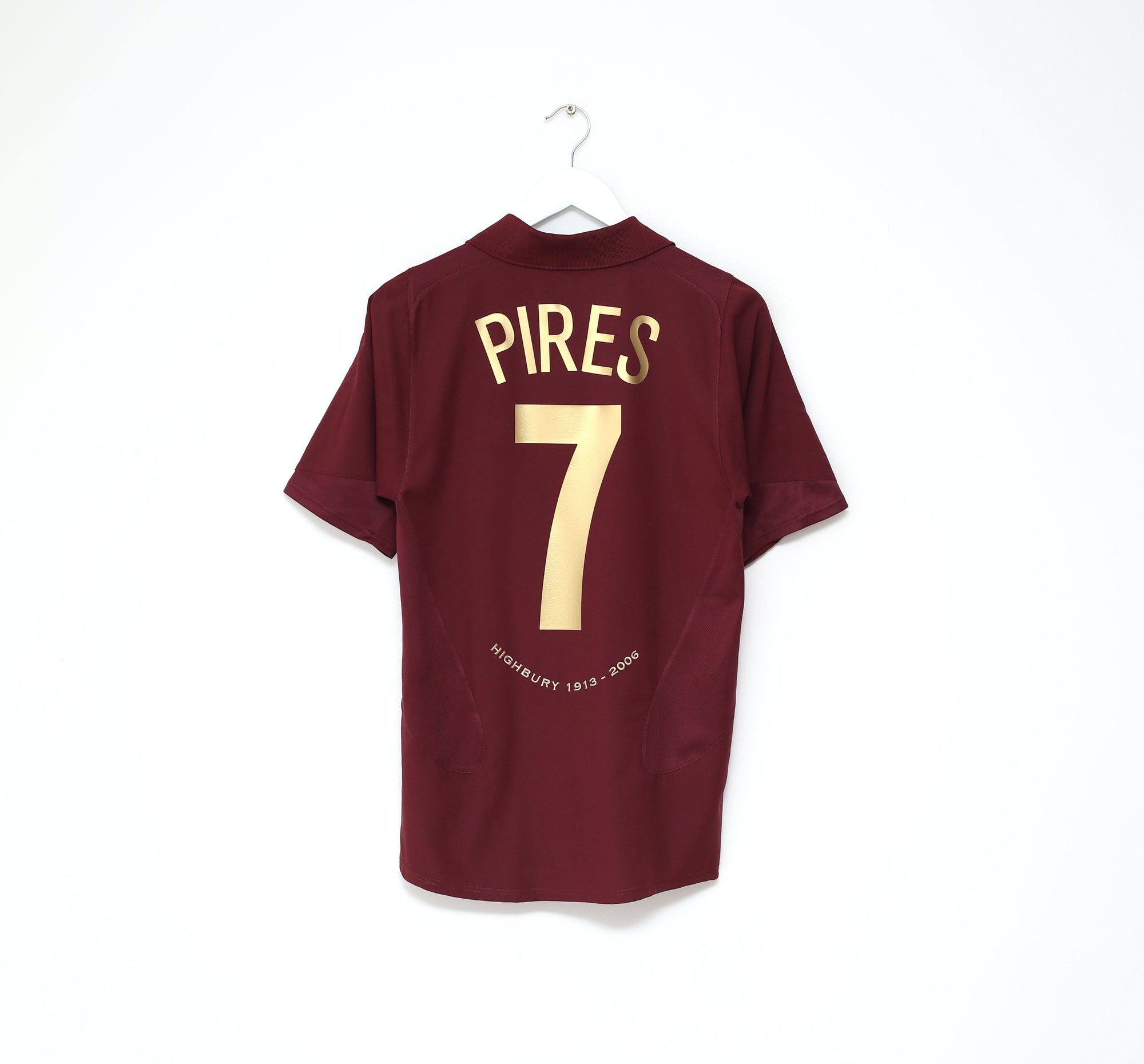
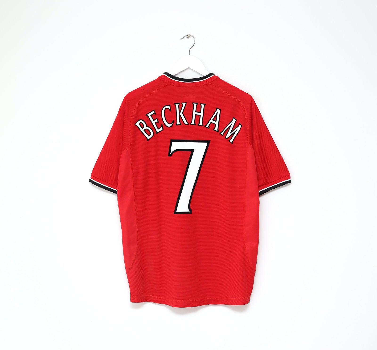
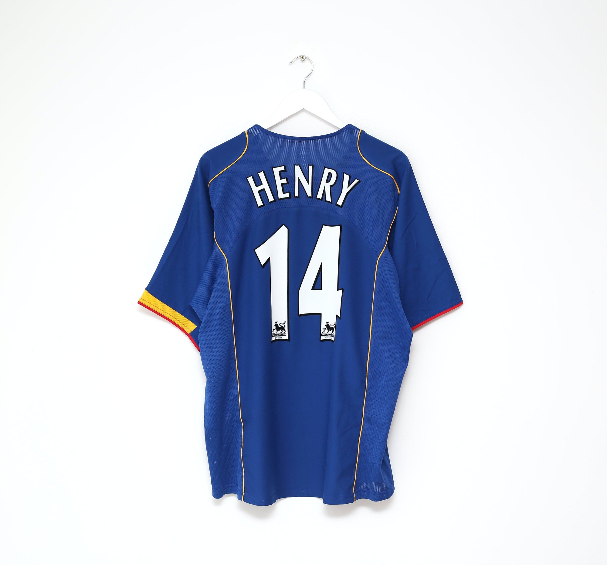
There had only ever been 3 league-wide typefaces in Premier League history prior to this week. The first two iterations lasted a healthy 10 years (1997-2007, 2007-2017) before the 2017 change which has now been superseded. In a sentence, we ought to have had 10 years of the 2017 style...

Avery Dennison, the manufacturing company who specialise in labels and essentially, shirt namesets, are the masterminds behind the new Premier League font. You may have already heard of Avery Dennison as the company have been producing names and numbers for the Premier League since 2019. They're incredibly slick operators, as evidenced by the polished marketing video that accompanied this week's launch, but the new font demonstrates little innovation on the surface.
In and of itself the 'evolution more than revolution' approach is not a bad one most of the time. Despite a fairly middling aesthetic, the 2017 Premier League font had a lot of things going for it. It was bold, legible and free from any unnecessary frills which often accompany shirt typefaces. A development on this base makes sense, even if it does feel quite soon. Unfortunately the 2023 look is hardly a step up at all in terms of aesthetic.

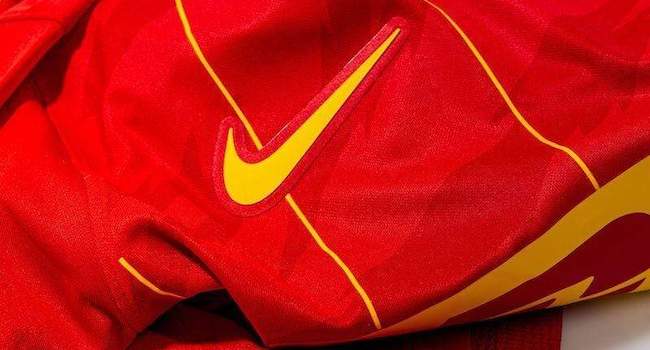
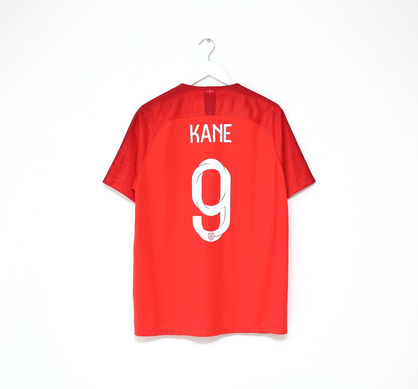
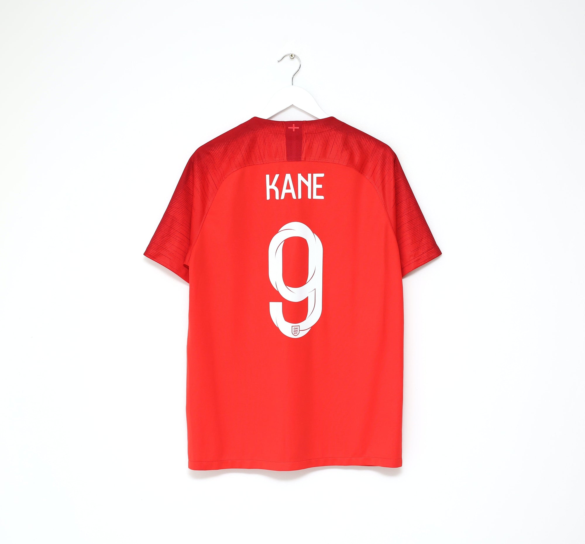
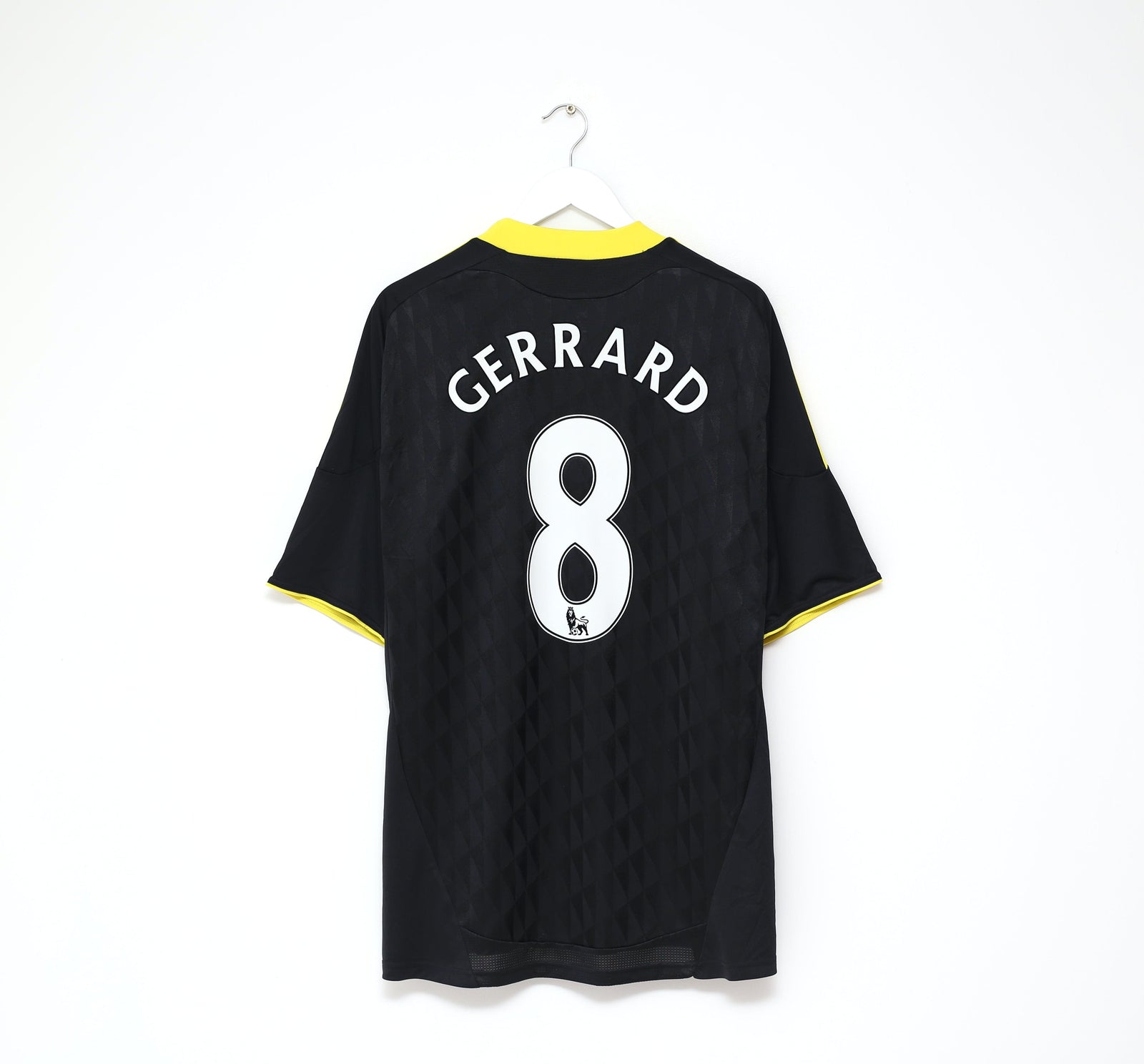
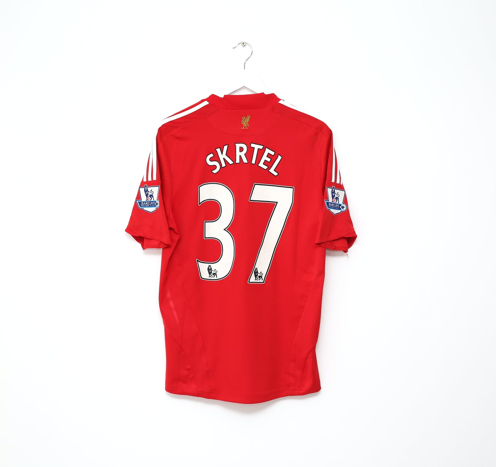
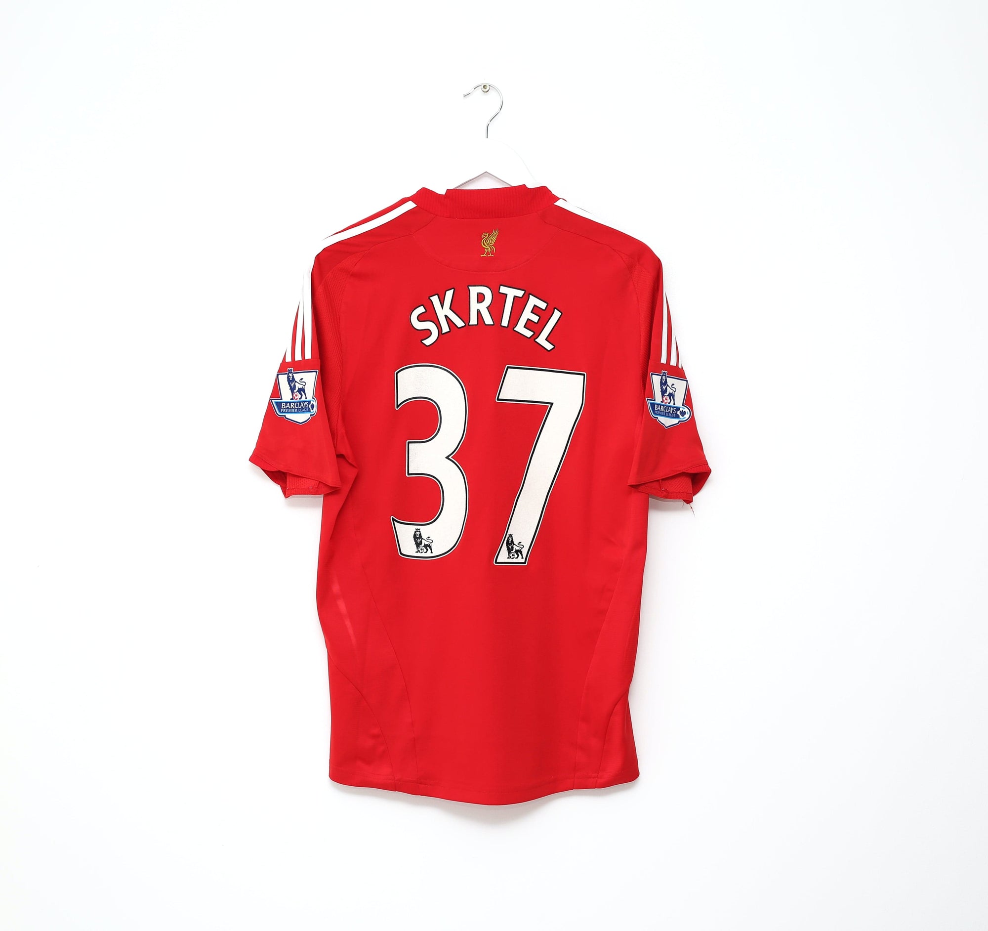
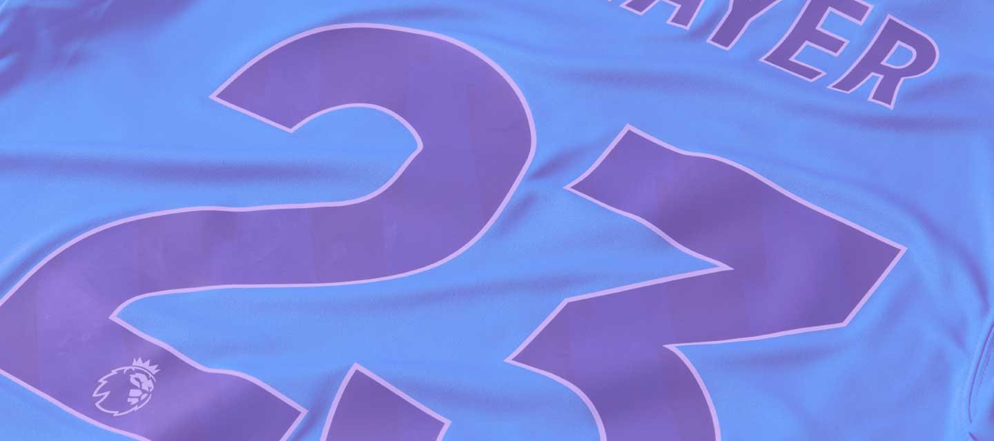
The changes that have been made are virtually imperceptible. On the names and numbers themselves, they will be larger on the back of the shirts, but the overall look is very similar with only minor tweaks. One addition which had a lot of potential was the introduction of a pattern within the numbers. The particular pattern has been seen on various Premier League material since their most recent rebrand in 2016, but the minimal level of contrast between the base of the numbers and the pattern is too safe in my opinion. You can barely see it for example on the red numbers above.

On a more positive note there's been a simplification of the sleeve patch, which now just features the lion's head as opposed to a circular design. Though I've never fully warmed to the lion head look (call me nostalgic but I miss the full lion aesthetic) I like the change as a whole here.
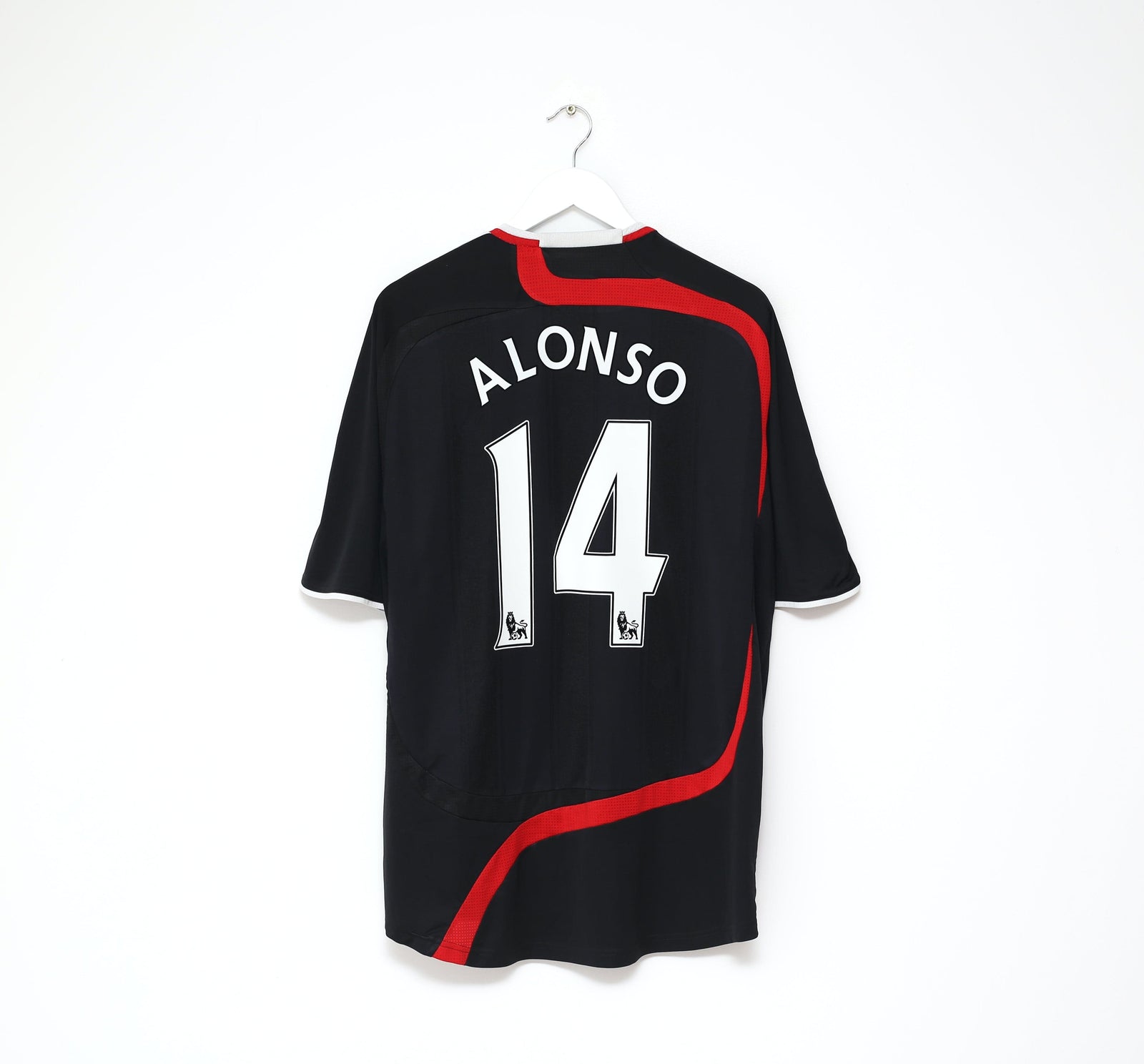
But finishing on another low note, I'm particularly disappointed in what appears to be a continued lack of colour options. A rigid set of colours limits many shirts in terms of design, and though the majority of teams are able to roll with white or black with no issues there are many shirts which would benefit from names and numbers that match the secondary, tertiary colours of the shirts. Given that kits need prior approval from the league anyway, I see no reason why we couldn't open the playbook completely for teams and brands and then still have an approval process to avoid any bad matches for considerations like colour blindness.

See you for the next rebrand in 2028.