

Shirt manufacturers typically have themes which they apply to their portfolio of teams in any given year.
Take adidas and their art influenced approach this year, or their 2018 movement which saw a range of retro tinged creations, many of which were the talk of the World Cup.
Puma have adopted a distinctive city-inspired approach in 2020, and it’s been met with a warm reaction across the board. Beautiful kits for the likes of Italy, Marseille and Manchester City have struck a great balance between communicating the overarching theme, and actually ending up with an aesthetically pleasing kit that works in its own right.
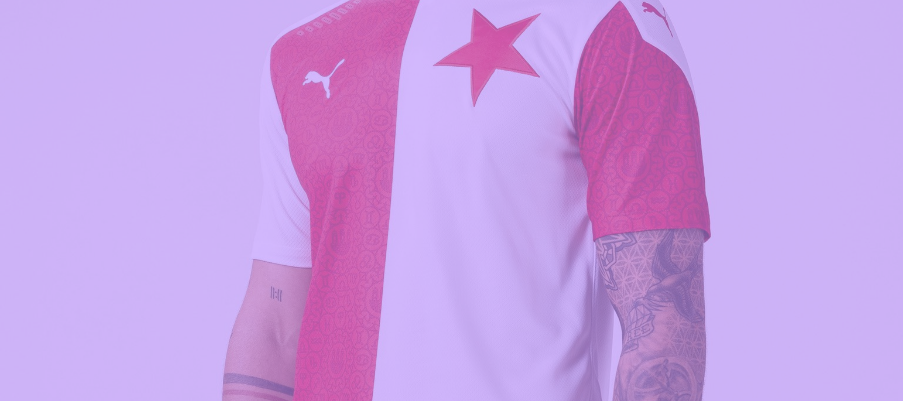
Slavia Prague are another side with an incredibly beautiful example of how the city approach can work, and despite some stiff competition it has a justifiable claim as the best Puma shirt of 2020.
The 2020 Slavia Prague home shirt builds on the traditional half and half red and white design which the team have always used, elevating the look with a stunning pattern used exclusively on the red portions of the shirt.
The new Slavia Prague shirt. 🌟 pic.twitter.com/W1y9jo73ak
— Art of Football (@Art_of_Football) July 15, 2020
I love this considered balance, where the crisp white sections of the shirt complement the busier red section. I say busier, the pattern is subtle enough so as not to distract, and in an age where bold, ‘disruptive’ patterns are on the rage, this design serves as a great example that less is sometimes more.
If we zoom in on the pattern itself, we see a nod to one of Prague’s most famous landmarks. The Prague Astronomical Clock is a stunning sight in real life ,and its beauty has been channeled into a tasty repeating circle design here. I love the intricacy, where small symbols within circles neatly interlock, and it’s an effective look both up close or from afar.
The most dominant feature is the giant, upside down star crest, notable for its size on the shirt. Once again this isn’t unique to this particular shirt, but it doesn’t have to be, as anything else would look second best.
At first sighting the shirt was sponsorless, and many worried that an inevitable sponsor would completely derail the good-looking train, and whilst I won’t pretend that the sponsor we’ve ended up with has improved the shirt in any way, it is at least integrated into the design quite respectfully with the text of the logo treated in a half and half red and white look.
We’ve seen a lot of Puma shirts inspired by the city a team plays in, and if we were planning a world tour of locations (once things are back to normal), Prague would be first on my destination list.
FSC Approved is a lovingly curated list of shirts that deserve to be in the conversation as good, possibly even great football shirts, no matter who you support or what your taste in shirts is. See them all here.