100% authentic | Shipped from UK | Rated Excellent on Trust Pilot
100% authentic | Shipped from UK | Rated Excellent on Trust Pilot
Vintage shirts
Modern classics
Concept kits
Add description, images, menus and links to your mega menu
A column with no settings can be used as a spacer
Link to your collections, sales and even external links
Add up to five columns
Add description, images, menus and links to your mega menu
A column with no settings can be used as a spacer
Link to your collections, sales and even external links
Add up to five columns

Every shirt from the 92-93 Premier League season rated
by Phil Delves February 05, 2022 14 min read
Premier League shirts are in a pretty good place right now. But for all the creativity and quality we’ve seen this year, nothing compares to the classics, right? If we were to look back at the kits of yesteryear, would we be impressed or underwhelmed?
I’m going to cast my eye over home and away kits from each team on any given year in Premier League history, giving each team a grade whilst trying to take into account the contributing factors at the time.
We’ll start with 1992/93, the dawn of a brave new world.
We've only gone and rated every single kit from the 1992-93 Premier League season
— Football Shirt Collective (@thefootballsc) November 20, 2019
Words: @phildelves
Illustrations: @from12yards_
🇹 🇭 🇷 🇪 🇦 🇩 👇 pic.twitter.com/ROKL8locga
Illustrations: From 12 Yards
Arsenal
@arsenal x @adidasUK
— Football Shirt Collective (@thefootballsc) November 20, 2019
This is adidas’ best work, a daring combination of triangles and gradients.
Grade: A+ pic.twitter.com/GfihzN7dZH
I think we might have peaked already. Seriously
For Arsenal’s home kit, we have a design which feels decidedly fresh. The adidas Trefoil has been replaced by a brand new adidas Equipment logo, which now sits directly on top of a centralised Arsenal crest. These changes would be enough, but we also have a new interpretation of the three stripes, with bars of red and blue cutting across by the shoulders.
And then on the away side, we have a look which needs no introduction. The ‘bruised banana’ is back for another season, and it’s a joy to behold! This is adidas’ best work, a daring combination of triangles and gradients. The colour is strange and the effect is slightly disorientating, but it’s exactly those qualities that make this one of my favourite shirts this year.
Grade: A+
Aston Villa
@astonvilla x @UmbroUK
— Football Shirt Collective (@thefootballsc) November 20, 2019
Umbro’s laced collar home kit has a certain nostalgic charm.
Grade: C+
👉 https://t.co/DnOvMz7yz0 pic.twitter.com/i4U8KBBR6g
We’re seeing a lot of innovative thinking across the team’s in the new Premier League, but sadly Aston Villa are on the outside looking in from a kit perspective.
Umbro’s laced collar home kit has a certain nostalgic charm, but I can’t help but feel the shirt as a whole looks dated. Perhaps I’m still pining for the days when hummel were working their magic in the Midlands, as it’s only been 2 years since that sad divorce.
Villa’s away kit has been the same since Umbro came on board, though it’s sneakily quite a smart design in my eyes. The black and blue shapes aren’t a million miles from the new three stripes alignment we’re seeing for Arsenal’s home kit, and it makes for a nice tonic to the more pedestrian home.
Grade: C+
Blackburn Rovers
@Rovers x @ASICSUK
— Football Shirt Collective (@thefootballsc) November 20, 2019
There are no gimmicks, just a strong striped design which may as well be an AC Milan kit
Grade: A
👉 https://t.co/DnOvMz7yz0 pic.twitter.com/tQKTIWzcGw
Asics deserve a tonne of credit for their Blackburn kits.
On the home side, I’m glad to see a return of the darker blue. I’m also a fan of the half and half collar design, after several years of a predominantly red look. These relatively simple changes add up, and help to preserve one of the most iconic designs in English football at the moment.
Things are just as good on the away side. There are no gimmicks, just a strong striped design which may as well be an AC Milan kit. I mean that as the strongest of compliments, this is one of the best away kits in the league for me.
Grade: A
Chelsea
@ChelseaFC x @UmbroUK
— Football Shirt Collective (@thefootballsc) November 20, 2019
The subliminal pattern on this shirt is one of the better ones in the league, so I’m happy to see it again this year.
Grade: B
👉 https://t.co/DnOvMz7yz0 pic.twitter.com/9nMp6XSCRc
Chelsea have enjoyed a productive spell with Umbro since teaming up in 1987, and there are no signs of that changing.
In fact, there are almost no changes for The Blues home kit compared to the 1991/92 season, with the only update of note being a switch to white socks. The subliminal pattern on this shirt is one of the better ones in the league, so I’m happy to see it again this year.
The new away kit sees a predominantly white and red pinstripe design, which would be great in my books were it not for another laced collar (à la Aston Villa home). Still, this look is a good contrast to the home, so even though it’s not to my personal taste it makes a lot of sense.
Grade: B
Coventry
@Coventry_City x @RiberoSports
— Football Shirt Collective (@thefootballsc) November 20, 2019
If you want a fun set of kits, look no further than Coventry.
Grade: B-
👉 https://t.co/DnOvMz7yz0 pic.twitter.com/iOwqKEdOoq
If you want a fun set of kits, look no further than Coventry.
Ribero have pushed the boat out in more ways than one this year, and for The Sky Blues home kit we have a busy pattern which looks like it’s been lifted straight off a bus seat. I love it, in all its messiness.
It’s not even the most daring design of the team though. That honour goes to the away kit, with an aesthetic which looks to me like a juicy piece of marbled steak, at least from a distance. It’s not traditional, and I appreciate this will be on many people’s “worst kits of 1992” lists, but I simply appreciate this pattern study we’ve been gifted across home and away, for all it’s wackiness.
Grade: B-
Crystal Palace
@CPFC x bukta
— Football Shirt Collective (@thefootballsc) November 20, 2019
I’ve praised a couple of teams already for sticking with previous designs, but in the case of Crystal Palace I’m crying out for something different.
Grade: D
👉 https://t.co/DnOvMz7yz0 pic.twitter.com/mmHSpBeulu
I’ve praised a couple of teams already for sticking with previous designs, but in the case of Crystal Palace I’m crying out for something different.
Barring a change in sponsor (and a downgrade at that), this is essentially the same design as we saw two years ago. A change to blue shorts or some other tweaks wouldn’t have gone amiss. The away is a very ‘basic Norwich’ type look, which is a contrast to the home from a colour perspective, but equally as uneventful.
Grade: D
Everton
— Football Shirt Collective (@thefootballsc) November 20, 2019
In many ways the Everton kits bear resemblance to Chelsea, with Umbro sticking with a strong design which boasts a superb subliminal pattern. It’s the kind of look which is best appreciated up close, and a great example of 80s class and 90s development.
From a colour perspective, The Toffees away kit is an intriguing choice with a navy and salmon combo. I really like it, especially given the historical significance of salmon/coral, and it’s a lovely development on the (strong though common) previous yellow away kits.
Grade: B+
Ipswich Town
Ipswich Town x Umbro
— Football Shirt Collective (@thefootballsc) November 20, 2019
Ipswich were easily one of my favourite clubs in the 80s when it came to shirts. They swept up during the entirety of the decade, so much so in fact that it was always going to be a struggle once we entered the 90s.
Grade: C+
👉 https://t.co/B16Fp4hXQt pic.twitter.com/1WOTPX3gnZ
Ipswich were easily one of my favourite clubs in the 80s when it came to shirts. They swept up during the entirety of the decade, so much so in fact that it was always going to be a struggle once we entered the 90s.
Their new home kit is a good example of their decline. It’s not the worst shirt by any means, and the reintroduction of white sleeves makes a lot of sense, but the collar is a little clunky for me and there’s simply not enough to get excited about.
Like Blackburn, we have a really smart looking AC Milan-esque away shirt, but I’m still overwhelmed as a whole.
Grade: C+
Leeds United
@LUFC x @admiral1914
— Football Shirt Collective (@thefootballsc) November 20, 2019
There’s something quite pleasing about the fact the reigning champions have kits made by one of the champions of the kit game in Admiral.
Grade: A
👉 https://t.co/B16Fp4hXQt pic.twitter.com/nQ5b68EtlO
Oh boy, Admiral have still got it!
There’s something quite pleasing about the fact the reigning champions have kits made by one of the champions of the kit game in Admiral. Both home and away designs have a lot going for them, starting with the home which features an incredibly tasteful wraparound collar. It looks so good that I honestly can’t believe we haven’t seen more across the league (it certainly would have boosted my thoughts for Villa and Ipswich amongst others).
Where the home kit is understated though, the away kit completely flips the script in the other direction. A daring graphic completely dominates proceedings, but thankfully a strong colour scheme manages to keep the shirt from being completely untamed. This might be a little too much for some, but I’m really glad to see this kind of look.
Grade: A
Liverpool
@LFC x @adidasUK
— Football Shirt Collective (@thefootballsc) November 20, 2019
The best thing about the complimentary home and away designs is that the pattern on the shirts is reflected on the shorts.
Grade: A -
👉 https://t.co/B16Fp4hXQt pic.twitter.com/x5X8BDf0Cd
Given the quality of their kits, there isn’t nearly enough adidas in the league. Like Arsenal, Liverpool are the beneficiaries of the fine work of the three stripes, and though the base design of both their home and away kits remains unchanged from 1991/92, they continue to be one of the best dressed teams in England.
The best thing about the complimentary home and away designs is that the pattern on the shirts is reflected on the shorts. This sort of unified design thinking makes a huge difference. It’s pointing out the various subtle changes too, like the new adidas equipment logo, the change of sponsor and an updated crest. In pretty much every case. Evolution not revolution.
Grade: A-
Manchester City
@ManCity x @UmbroUK
— Football Shirt Collective (@thefootballsc) November 20, 2019
Umbro have teased us already with some decent kits, but their best work might just be on the blue side of Manchester.
Grade: A
👉 https://t.co/B16Fp4hXQt pic.twitter.com/PrZUjmm7ih
Umbro have teased us already with some decent kits, but their best work might just be on the blue side of Manchester.
City seem to be a perfect match for the double diamonds, and both their home and away kits have a lot going for them. On the home side (a continuation from last season), the pattern on the base of the shirt is dynamic without being overbearing. The complementary blues also make for a nice touch.
It’s the new away kit which will take the headlines though. Umbro have gone all in with a vibrant shade of purple in tandem with white pinstripes, and it’s a big yes from me.
Grade: A
Manchester United
@ManUtd x @UmbroUK
— Football Shirt Collective (@thefootballsc) November 20, 2019
United have made the switch from adidas to Umbro and unfortunately it’s turned out to be quite a downgrade, at least for year 1.
Grade: C
👉 https://t.co/B16Fp4hXQt pic.twitter.com/7Uva1cDHP0
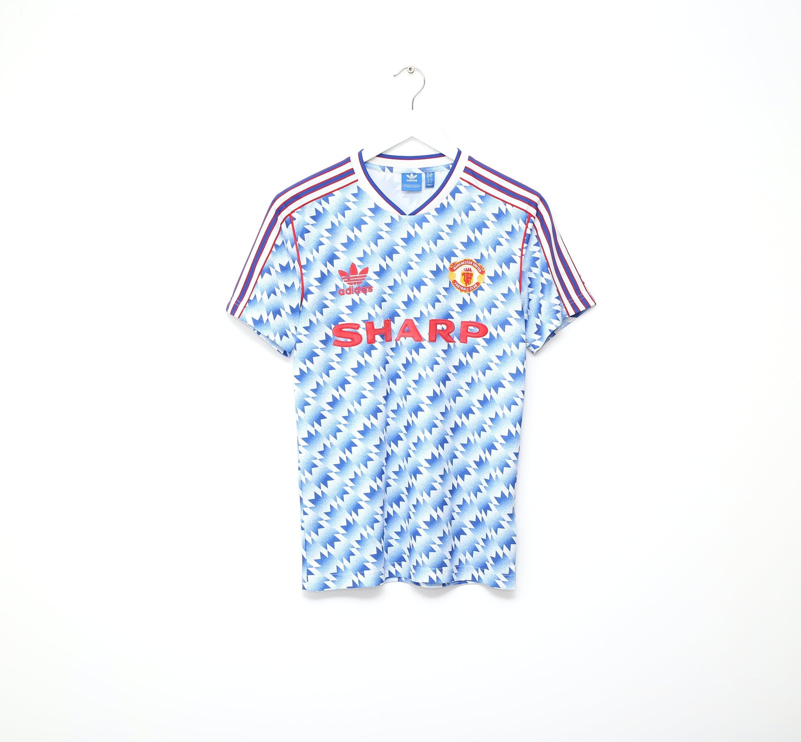
United have made the switch from adidas to Umbro and unfortunately it’s turned out to be quite a downgrade, at least for year 1.
Things aren’t too bad on the home side, with a little bit of unnecessary lace spoiling what is a reasonably smart look. But it’s on the away kit where I think things fall down.
It was always going to be hard to follow the away kit from the past 2 seasons, which was one of my favourite shirts across all teams. In its place is a rich blue shirt, with the United crest enlarged and used as a pattern. It’s not crazy enough to be interesting, but not clean enough to be classy. It’s a horrible middle ground.
Grade: C
Middlesborough
@Boro x @admiral1914
— Football Shirt Collective (@thefootballsc) November 20, 2019
Boro’s kits look like an inferior version of Leeds’ to me. It’s great to see Admiral mixing things up on the home side, but the finished product looks like a shirt caught between several different directions.
Grade: B-
👉 https://t.co/B16Fp4hXQt pic.twitter.com/eEuHYMuCUh
Boro’s kits look like an inferior version of Leeds’ to me. It’s great to see Admiral mixing things up on the home side, but the finished product looks like a shirt caught between several different directions.
Unfortunately things don’t get better for the away kit, and it serves as a good example of how colours can make all the difference. This pattern worked great for Leeds, but in the white red and black of Boro I have a completely different reaction. At least we’ve got some talking points mind you.
Grade: B-
Nottingham Forest
@NFFC x @umbro
— Football Shirt Collective (@thefootballsc) November 20, 2019
I’ve been a little negative about old-school designs and features so far, but I can’t deny that the direction that Umbro have taken for Nottingham Forest is a really strong one.
Grade: B
👉 https://t.co/B16Fp4hXQt pic.twitter.com/fQaH7E80hd
I’ve been a little negative about old-school designs and features so far, but I can’t deny that the direction that Umbro have taken for Nottingham Forest is a really strong one.
In what feels like an upgrade on last season, we now have pinstripes which feel very 80s in a good way. Now feels like the right time to bring back the aesthetic, and it ends up standing out amongst a crowd with very few pinstriped kits at all.
The away kit holds its own too, with a lovely pattern which sees ‘forest’ in the shape of Umbro’s diamond logo throughout. It’s not spectacular but it’s pleasing on the eye.
Grade: B
Norwich City
We were hitting a bit of a slump across the past couple of teams, but we’re back in business now.
In fact, I’m gunna cut to the chase. Norwich City have my favourite kits in England this year. Ribero have stepped up to the plate in more ways than one, trumping the likes of adidas and Umbro. Sure, the new home kit looks similar to Coventry from a pattern perspective, but there are two key differences for The Canaries here.
The pattern actually looks slightly less busy, and the extra breathing room is welcome. And of course, the most obvious difference is the colour palette. Norwich’s yellow, green and white combo is distinctive and packed full of character.
The away kit won’t grab as many headlines, but once again we have a pattern which improves on what Coventry had. The marbley aesthetic has been consigned to the sleeves, which leaves us with a much more balanced look that reminds me of the kind of shirts we’re seeing out of up and comers Nike for teams like Dortmund and PSG.
Grade: A+
Oldham Athletic
Oldham Athletic x @umbro
— Football Shirt Collective (@thefootballsc) November 20, 2019
I feel like I should appreciate Oldham’s kits more than I do.
Grade: C+ pic.twitter.com/lRWKtQt6Zd
I feel like I should appreciate Oldham’s kits more than I do.
The home shirt essentially boasts the same design as a number of Umbro shirts across the league, and though it’s not the most exciting or unique, you’re in good hands with Umbro even at the worst of times.
Oldham’s away kit features the same collar as Ipswich’s home, and it hasn’t grown on me since we spoke about that. The use of white of the sleeves presents an intriguing overall look, but as a whole this is a collection of kits that don’t quite cut the mustard for me.
Grade: C+
QPR
QPR x Clubhouse
— Football Shirt Collective (@thefootballsc) November 20, 2019
Here we have our first and only set of hooped kits. In itself that already puts us on a decent footing, but aside from the novelty of a unique set of designs I’m not falling in love with what QPR and Clubhouse have to offer.
Grade: C pic.twitter.com/yFyiVNH2u6
Here we have our first and only set of hooped kits. In itself that already puts us on a decent footing, but aside from the novelty of a unique set of designs I’m not falling in love with what QPR and Clubhouse have to offer.
I’d really like to see some sort of subliminal pattern. A fresher colour scheme on the away side could really help too, given the frequency of red and black designs. Again, the fact these are the only hooped kits in the league is a big help, but were those hoops rotated we’d be looker at relegation fodder
Grade: C
Sheffield United
Sheffield United x Umbro
— Football Shirt Collective (@thefootballsc) November 20, 2019
I hate to sound like a broken record (especially as it is very much a personal gripe), but Umbro’s clunky laced collar holds this back from being a top half contender.
Grade: B- pic.twitter.com/6XPzHXLsP3
After a few years of much thinner stripes, Sheffield United return to a more traditional stripe thickness. I hate to sound like a broken record (especially as it is very much a personal gripe), but Umbro’s clunky laced collar holds this back from being a top half contender.
For the away kit we have the same design from last year, with the returning yellow look offering a simple but effective partner to the home effort.
I should also mention the lovely green kit The Blades will soon be donning. Not only is the shade of green superb, but the pattern is one of those busy, subliminal ones which gets my heart pumping.
Grade: B-
Sheffield Wednesday
Sheffield Wednesday x @umbro
— Football Shirt Collective (@thefootballsc) November 20, 2019
In the battle for supremacy in South Yorkshire, I’m giving Wednesday the edge.
Grade: B pic.twitter.com/6c9bzREK6G
In the battle for supremacy in South Yorkshire, I’m giving Wednesday the edge.
Granted the home kit could do with update, given that the only significant change has been the sponsor since 1989, but even after a few seasons this look hasn’t aged badly at all. There’s no unnecessary distractions with things like the collar, and the new sponsor doesn’t take away from proceedings.
The away kit is a striking yellow and black pinstripe look reminiscent of City’s away kit. I love the liberal use of black, which elevates the shirt from being just another yellow away kit to a kit with character.
Grade: B
Southampton
Southampton x Admiral
— Football Shirt Collective (@thefootballsc) November 20, 2019
Blue flames adorn the whole of the shirt, this is exactly what the Manchester United away shirt was missing, a well-executed pattern which is memorable and unique.
Grade: B- pic.twitter.com/siwXCFTCDu
Rounding off a trio of striped home kits is Southampton. In a similar situation to Aston Villa, I can’t help but miss the days of hummel.
Admiral have done an admirable job though, and indeed the 1991/92 home design has been retained which isn’t a bad thing at all given how little there is to complain about with the kit.
The away shirt from last year has also returned, but once again I don’t mind given the relative success of the design in my eyes. Blue flames adorn the whole of the shirt, this is exactly what the Manchester United away shirt was missing, a well-executed pattern which is memorable and unique.
Grade: B+
Tottenham Hotspur
Spurs x Umbro
— Football Shirt Collective (@thefootballsc) November 20, 2019
Spurs keep both their kits from last year, and though I would’ve loved to have seen a bit of variation for the new season, I also think Umbro have done a good job here.
Grade: B+ pic.twitter.com/iIwFxiM5xe
Spurs keep both their kits from last year, and though I would’ve loved to have seen a bit of variation for the new season, I also think Umbro have done a good job here.
The pattern on the home shirt is tasteful, and don’t miss the cuffs either which feature one of the more interesting designs you’ll see. The away kit teases us with a busy, checkerboard pattern. I wish we saw more of it, but it’s there nonetheless.
Perhaps the best kit of the lot though is the returning third shirt. The "SPURS" motif that covers the top of the kit is an unusual aesthetic, but it stands out across the league in a very good way.
Grade: B+
Wimbledon
Wimbledon x Admiral
— Football Shirt Collective (@thefootballsc) November 20, 2019
The subliminal pattern on both kits works well for me, and I actually think I’m able to get over the fact the club wore kits from a certain manufacturer beginning with “h” in the 80s.
Grade: A- pic.twitter.com/kLyF8ldvfB
Rounding things off are Wimbledon.
Admiral’s shirt (continuing from last season) are nostalgic and clean. Everything from the colours (blue and yellow for the home, red and white for the away) feel to the lack of a sponsor feels “right”.
The subliminal pattern on both kits works well for me, and I actually think I’m able to get over the fact the club wore kits from a certain manufacturer beginning with “h” in the 80s.
Grade: A-
If these shirts have got you in the mood for classic Premier League shirt, check out our own collection of hand-picked vintage shirts on our store. You can browse them here.
Phil Delves
As Head of Content, Phil is the creative playmaker of the team, covering every angle of football shirt news in our blogs and weekly Newsletter. Whether it's telling your fakes from your authentics, or deep dives into the newest football shirts designs, Phil will have all your football shirt content needs covered.
Leave a comment
Subscribe
Sign up to get the latest on sales, new releases and more …


